It’s coming together well on the page:
The whole centrespread is being given over to the Christmas displays in London’s biggest shops – Harrods, Harvey Nicks, Selfridges etc – as painstakingly shot by our photographer and set against a festive red background. The designer’s almost finished: a couple of pictures left to insert. It looks lovely.
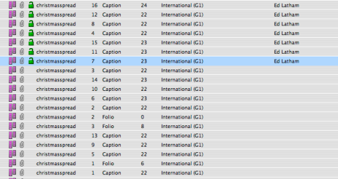
From the front, that is. But rather than having one large caption explaining the concept of the spread, if you look closely at the image, the grey lines below each picture are 16 small individual captions, one for each picture, all of which need writing. So from the back – that is, in the subs’ queue – it looks like this:
Some subs are quite nervous of the standalone picture stories that you often see used to liven up a page. Not because of the headline: normally the image chosen is sufficiently striking as to offer several jokey possibilities. The problem is with the four or five empty lines of caption space beneath: a space in which, instead of being an editor, the sub is forced to become a writer. That’s a lot of real estate to fill when you’re not in training for anything longer than a standfirst. And the problem is compounded by the fact that such stories come straight from the picture desk and are chosen almost entirely on visual appeal, so when you go over to the head of photography and ask him what the news angle is, you get a cheerful “Oh, there isn’t one really.”
That’s not quite the problem here: here the problem is that there are 16 captions on the same page, all with the same news angle. The first caption is easy: it’s the next 15 that are the problem. This is going to test powers of variation to the utmost. How many synonyms can you think of for “window display”? Not 16, right? Nor me. You know you’re in trouble when you’re checking in the style guide to see whether “tableau” takes an “s” or an “x” in the plural.
Deadline adrenaline got the job done, as always. A little description, a dim awareness of the TV ad campaigns on which some the displays were based, and judicious reference to a similar gallery on the Harper’s Bazaar website whose creators had a much more acute grasp of the concepts than I did, and we were there. It wasn’t pretty, but at least it wasn’t dummy text. In a job where the major requirement is cutting, it’s surprising how often you find yourself needing to fill.
After that, anyone would need a break. So Ten Minutes Past Deadline is going on its inaugural Christmas holiday, to return in the new year with a fresh determination to seek out error and a renewed horror of periphrasis. Until then, may you have a beneficent festivaltide, and all felicitations for the twelvemonth in prospect. Happy Christmas, everyone.


Leave a comment