Archive | Graphics RSS feed for this section

Tourist misinformation

31 Jan

Many years ago, I swear, Private Eye reprinted without comment a map from another publication showing the major cities of Spain in accurate relation to each other – but overlaid on an outline that was clearly the shape of France. The Tribune has had its moments with maps over the years, but I’ve never seen us do anything like that. And I’ve never seen anything quite like this pair either, on a public information point in no less a thoroughfare than Old Bond Street.

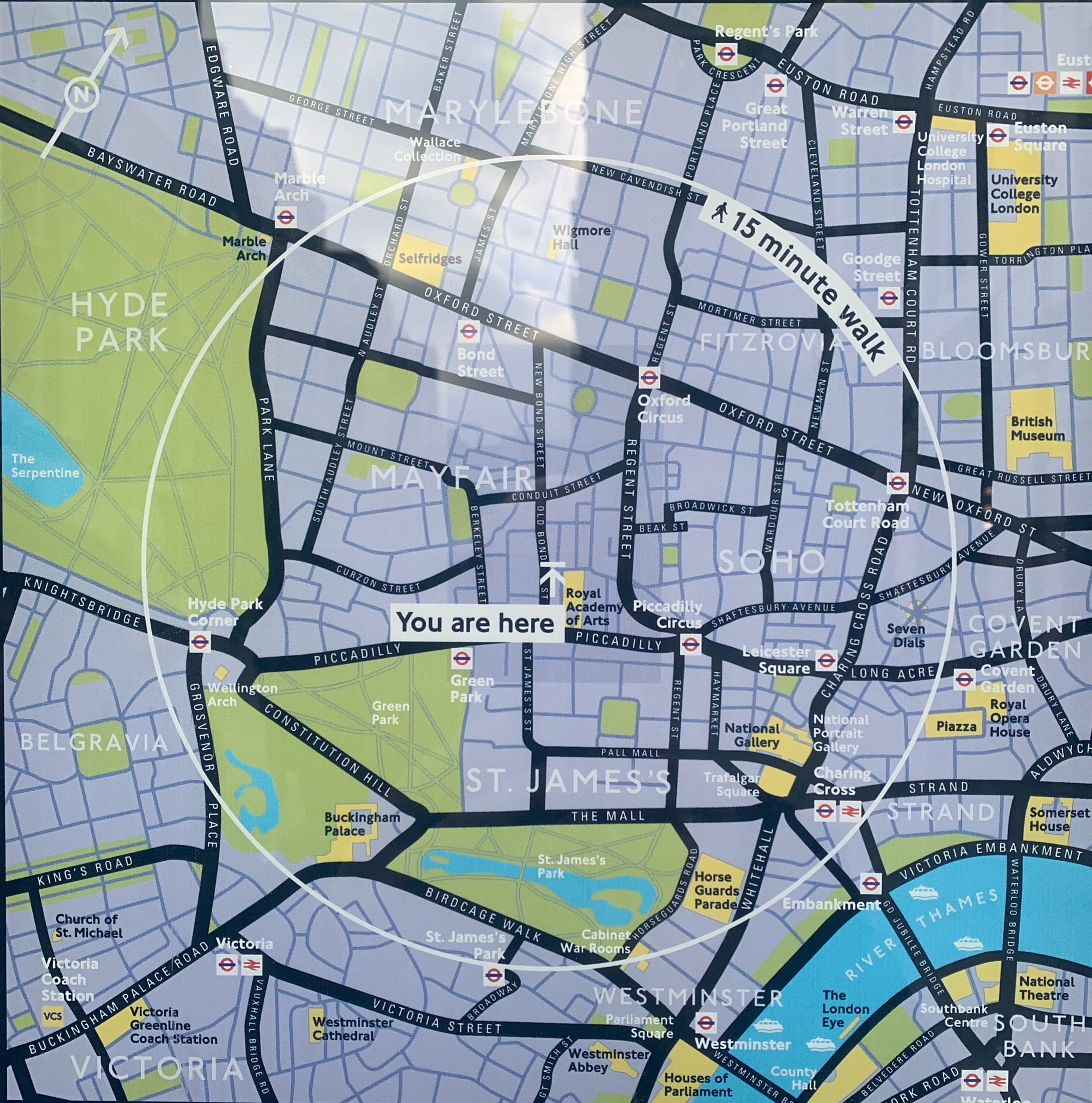
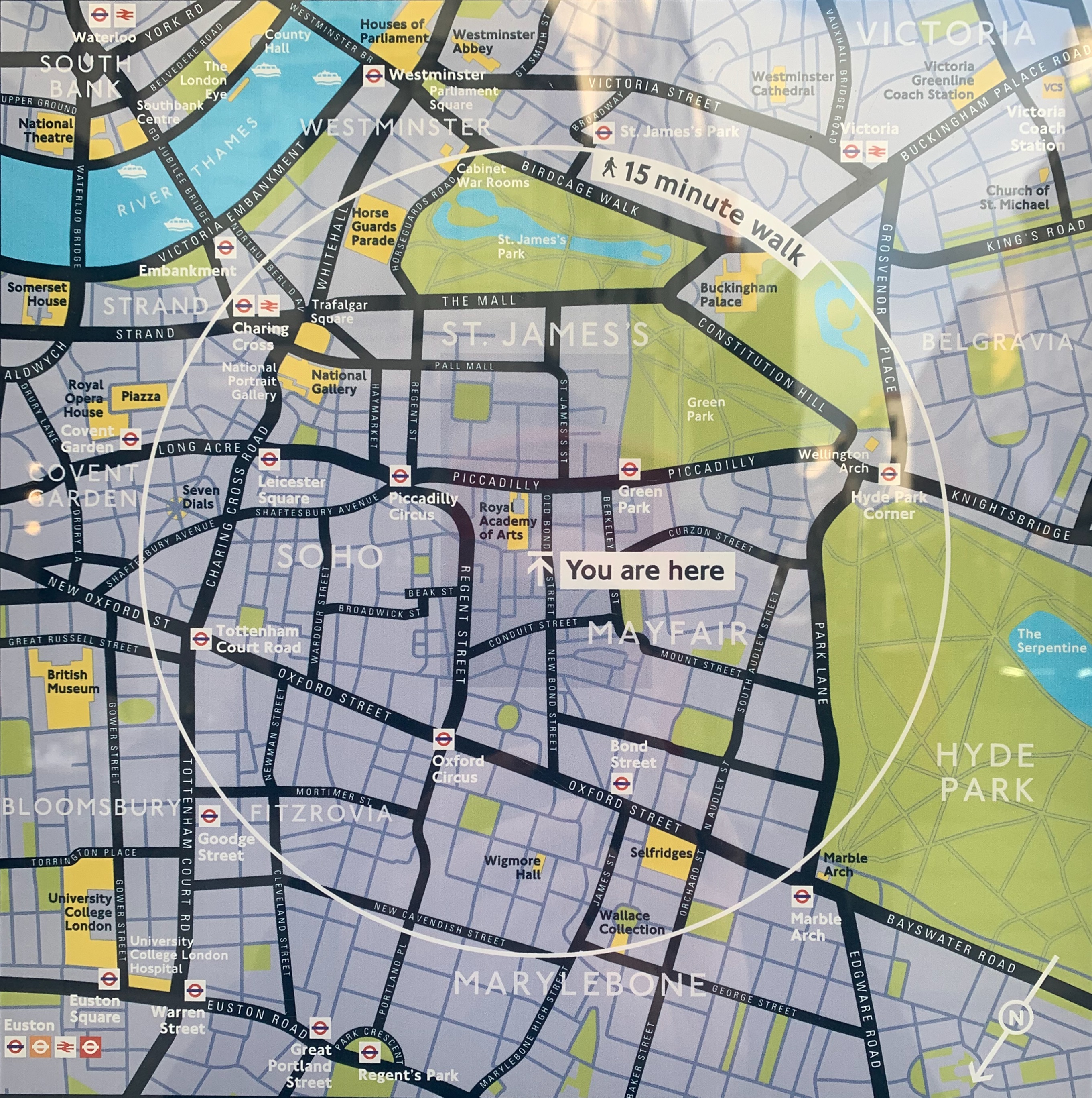
I was just passing on a meandering walk around the West End and stopped to look. The first map is a completely normal map of Mayfair for tourists. The second one, which was on the other side of the information point, is … well, I’m not quite sure what it is. I stared for a full minute trying to work out what I was looking at. Buckingham Palace seemed to be further south than Lambeth Palace. The South Bank was on the north bank. I had to walk round the sign and look at the first map again to realise what they had done: they’ve flipped the pictorial part of the map over while keeping the labels the same way up.

Now admittedly there is a discreet symbol on the bottom right showing that “North” is in what one would think of as a south-westerly direction, but is that what you would normally expect from a map like this – that visitors would have to mentally rotate it in the manner of a teenager doing a cognitive aptitude test? Taking it at face value, Hyde Park appears to be east of Mayfair, whereas of course it is west. If you glanced at this and set off using the position of the sun or your phone compass as a guide, you’d never find it. Even if you followed the street layout, you’d still start out the wrong way.

What could Westminster Council be thinking here? It threw me for a loop, and I was born in London and have lived here for the last 25 years. Imagine being a tourist and trying to work it out. I haven’t shown this to the Tribune’s graphics desk – who have been producing daily maps of the shifting tides of war in the Donbas with barely a mistake for 12 months – in case it distresses them. But this seems so finished, so “meant”, that I can’t shake the idea that I’m missing something, and that this is some known and legitimate form of map-making. I might get in touch with the council and see what they say – watch this space.

UPDATE: It has been patiently explained to the blog by its friends that of course the point of these maps is that they are “direction of travel” maps. I should have realised something like that by the fact that they were so different on opposite sides of the same signpost. The “upside down” map is for people walking in a southerly direction down Bond Street – it has been pre-rotated so that when you look at the map and then look up, you can see the street layout in front of you the way it’s drawn on the sign. I get it now! But just to make a few observations:

  • Apart from the very discreet North orientation arrow on the maps, there is no obvious “you’re facing this way” indicator on the maps, leading to point two.

  • What are your expectations of such maps? Mine would be that they would be simple north-at-the-top drawings in the context of public information points – the simple standard everyone would understand? But maybe that’s just me.

  • This would probably have been less confusing (to me, anyway) if Bond Street didn’t run almost north-south. That means the northbound map looks deceptively like a simple north-is-up map (although in fact it isn’t).

Marginal differences

14 May

Screen Shot 2015-05-10 at 17.00.15

Screen Shot 2015-05-10 at 17.01.12

It’s not all that hard to count to 331, but, as we can see above, there’s more than one way to get there.

In the aftermath of the general election, it fell to me to check the paper’s giant map of the seats won and lost across Britain on 7 May. In particular, the graphics department wanted to know how many gains – gross gains, that is: gains before losses – had actually been made, so that they could list them all around the map. Out of a total of 650 parliamentary seats, that seemed like an elementary request. Or so I thought, until I found that two reliable sources (the Guardian, top, and the BBC, above) were giving completely different figures.

To take the Conservatives as an example, both sources have them winning 331 seats in total. But the Guardian has them gaining 38 seats from other parties (and losing 10), while the BBC has them gaining 35 (and losing 11). How can that be? No wonder graphics was puzzled: I was too.

Clearly, since they imply net gains of 28 and 24 seats respectively, the two sums can’t even be working from the same base figure of constituencies held before the election. So what figures are they using? Subtracting the net gains from the total of seats now held – 331 – is an obvious place to start. That reveals that the Guardian (331 – 28) is working on a basis of 303 Conservative seats already held, while the BBC (331 – 24) is working on a basis of 307.

Hmm. Odd. Can we relate either of those two figures to data about the previous election? Time for a quick trip to the Electoral Commission’s website, where we find that … oh:

Screen Shot 2015-05-13 at 15.13.38

Now we have a third figure for seats won in 2010: 306. What’s going on? Can we not even agree on a figure for the number of seats the largest party in the country holds from one general election to the next?

And then, after slightly longer than one cares to admit, the light began to dawn. The clue to the Electoral Commission figure is down at the bottom of the graphic: “Speaker (1)”. The Speaker of the House of Commons is an apolitical figure who votes only in the most exceptional of circumstances; nonetheless, he or she is still notionally an MP who stands for election as a representative of one of the parties. And the current Speaker, John Bercow, is a Conservative: the Tory MP for Buckingham. So if you add him to the Conservative total, you get 307: the same as the BBC’s figure. And then it all starts to become a lot clearer.

Clearly, the BBC is using the data from the 2010 election as its basis point. So what is the Guardian using? One obvious possibility is that it is factoring in changes to the makeup of the Commons that have taken place since 2010. Can we account for the discrepancy by looking at byelection results in the last parliament?

According to parliament.uk, there were 21 byelections in the last parliament. Three of them resulted in the Conservatives losing a seat, and all three are still reasonably memorable events for political wonks: author Louise Mensch’s unexpected resignation from her seat in Corby in 2012, which resulted in a Labour win; and the high-profile defections of Douglas Carswell and Mark Reckless from the Tories to Ukip in the runup to the election, when both incumbents won their seats back under new colours.

That reduces the number of seats the Tories held in parliament from 307 to 304, which is getting closer to the Guardian’s figure. Could it be that the Guardian is simply discounting the Speaker’s seat? It seems not: the election interactive is clear that it is talking about all 650 seats in the country, not 649 as would be the case if Buckingham were excluded.

It’s only when, exploring the interactive, you discover the striking fact that ultra-safe Tory seat of Kensington is described as a “gain” that you find the last missing piece. Sir Malcolm Rifkind, the former foreign secretary and MP for Kensington, was suspended by the Conservative party, and ultimately decided not to stand for re-election, after being caught in a cash-for-access newspaper sting in February. Technically, therefore, as a sitting MP who has had the party whip withdrawn, he counted as a seat lost before the election, and therefore a Tory “gain” (from an “independent”) when his successor duly won. So the Guardian’s total, omitting Mensch, Carswell, Reckless and Rifkind, is also correct: 303.

So who’s right? In short, everyone. The BBC is working on a previous-election basis, using unmodified figures from the 2010 ballot. The Guardian is using eve-of-election figures, reflecting the actual position of the parties on the day before the country voted in 2015.

Both approaches have their strengths and weaknesses. If you work on an eve-of-election basis, you’re using running totals based on the quality of your own electoral research and arithmetic. If you work only on the official previous-election numbers, the maths is simpler, but you have to remember the “byelection factor”: some triumphant regainings of marginals lost in midterm will actually be “holds” for your purposes, and some routine victories for the winners of half-forgotten byelections actually “gains”.

If you’re wrestling with British electoral totals (and you might not be for another five years … although who knows?), here’s a table covering four of the most likely problems you may encounter (click to enlarge). As to how 2020’s calculations will go, if the major boundary changes and seat reductions planned by the Tories go through in this parliament – heaven only knows.

Screen Shot 2015-05-13 at 17.06.57


When to delete Luhansk

17 Feb


Screen Shot 2015-02-16 at 15.27.20

Friday afternoon, and an email comes in from our stringer in Ukraine, whose article has just gone live:

Hi guys,

I had sent an email earlier about the difference between Luhansk and Luhanske. Sorry for the confusion, but the place where I was today was Luhanske, not Luhansk as it says in the dateline right now.
Also, there is an error in the following graf; it should again be Luhanske, not Luhansk:

Burned-out trucks — some still smoking — lined the cratered highway from Artemivsk to Debaltseve, which remains in contention. Government soldiers who were trying to tow a damaged ambulance out of the partly ruined town of Luhanske admitted that anyone who went further down the highway toward Debaltseve would come under heavy fire from rebel small arms and artillery.

In this graf, however, it should be Luhansk, not Luhanske:

Two people were also killed and six wounded when a shell hit a packed cafe in the Kiev-controlled town of Shchastya near rebel-held Luhansk, a local official said, adding that other shells had struck elsewhere in the town.

In real life, there’s always some inconvenient homophone that would never be allowed to come up in fiction. Luhanske, where the stringer is, is 95 kilometres from Luhansk, right in the heart of the recent fighting around Debaltseve and one transliterated letter away from the much bigger rebel city, itself a scene of conflict in the struggle between east and west in Ukraine. And Luhansk also gives its name to the wider oblast, or province, that has declared itself a People’s Republic alongside Donetsk. (Luhanske itself is in Donetsk oblast, of course, not Luhansk oblast: that would be too easy.)

Saturday afternoon, right on deadline. The level of noise is increasing, the shouted instructions are coming faster and the production editor is handing round the international front page for a rapid press-read. The same stringer has filed a late update on the fighting from nearby Artemivsk, and it’s been hustled through the editing process and onto the page.

Although rebels have been able to virtually surround Debaltseve and pound it with rockets and artillery, the road connecting the city with Ukrainian forces in Artemivsk is not fully under either side’s control. Pro-Russia forces shelled the city 15 times and attempted to storm it early yesterday …

Yesterday a military ambulance delivered the body of a soldier killed in the village of Paschnya, which is in the no-man’s-land between Luhansk and Debaltseve, to the mortuary in Artemivsk.

Hang on. Luhansk. Is that … does he mean Luhansk? If he means the city, it’s miles away. Can there really be a no-man’s-land stretching 95 kilometres into another oblast?

Another hasty skim through the article, and there’s no sign of any reportage or sourcing from that far east: all the quotes and accounts come from forces and officials around Debaltseve. A quick check on Google Maps reveals that, yes, Debaltseve, Luhanske and Artemivsk are all close, linked by the E40 road; on the other hand, there’s absolutely no sign of a village called Paschnya anywhere. And the distraction is increased by the locator map on the page, right next to the paragraph in question: Debaltseve is marked, Donetsk is marked, and so is Luhansk, off to the east; but there’s no sign of Luhanske or Artemivsk. But then a check through the stored revisions of the article reveal that, inadvertently,  the ‘e’ was indeed deleted off “Luhanske” at an earlier stage.

The problem with journalism, or at least with newspapers, is that there’s never enough time to sort everything out properly. The fast read, panic over Luhansk, Googling and hasty conferring with a colleague has taken about two minutes. The best thing to do would be to reinstate the “e” in Luhanske, add a few lines to explain away confusion, recut the article to fit, and redraw the map at a slightly larger scale so that the town can be added to it (at its current scale, the blob for Luhanske would be right on top of the blob for Debaltseve).

But there isn’t time for that. All there’s time for is to reinstate the “e”, and, as a prophylactic against possible confusion, hurry over to the graphics desk and ask them to delete Luhansk, the city, off the map altogether, and reoutput it. There’s just enough time for it to auto-update on the page before it’s sent: at least it won’t look like a typo or lead readers astray.

Locator map

And then it was gone: the page was sent and ran like that for the first three editions. Looking back at it now, the single reference to Luhanske is a bit baffling without explanation, and, on the map, I see I completely overlooked that we’d referred to a nearby city as Horlivka in the text (which is correct Tribune style) and Gorlovka on the map (which is not).

But the stringer refiled after midnight, with a new top that explained clearly where Luhanske was: new quotes, new facts, rewritten all the way through. As the story acquired momentum through the night and into the next morning, the online version, updated regularly, was shared more than 500 times and drew more than 3,000 comments. The problems of the initial version were completely swept away.

It was just a first take; just a holding story for the early edition, before the ceasefire agreement took hold and the story really began. Some articles take a lot of effort and then only last for five hours. But you never know which ones will last and which ones will end up on the spike.

And if anyone finds Paschnya on the map, I’d be interested to know.