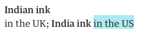
You should always put right a factual error, of course. But would you really issue a correction in the paper for not having followed your own house style?
This correction, in the Guardian earlier this month, is purely a matter of preference, not error. Style guides sometimes deal with issues of fact – warnings about, say common geographical mistakes – but this isn’t one of those times. This is just an absence of quote marks that doesn’t seem to affect the sense of the sentence; something that only someone who had read the style guide would even know was wrong.
Admittedly, the Guardian’s guide is publicly available online for those who take an interest, but it’s not as though the reader’s editor feels compelled to apologise for every lapse in consistency. For example, Guardian style calls for “focused” with one “s”; it sometimes appears with two, but there’s never been a correction about it.
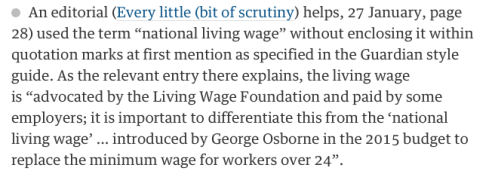
But the rest of the column makes it clear why these quotes matter. The Guardian has been a supporter of the Living Wage campaign, which urges employers to offer an hourly pay figure somewhat higher the statutory minimum wage. In the 2015 budget, George Osborne introduced what he called a “national living wage”, borrowing the campaign’s phrase but not fully winning its approval: his proposal does not include a higher rate for London, is not set according to a cost-of-living index, and came alongside a series of benefit adjustments for the lower-paid that were nowhere contemplated in the campaign’s calculations.
It is therefore the campaign’s, and the Guardian’s, position that the “national living wage” is not actually a living wage, but a rebranding and increasing of the minimum wage. So the style guide uses quotes to indicate that the phrase is not the paper’s but the government’s: it acknowledges the official title while maintaining its distance from it.
That means the correction is acknowledging not just a failure in neatness or consistency, but something bigger: a lack of critical thinking, a lapse in the acuity one would expect from the paper in its political reporting. A piece of parliamentary rhetoric has found its way into the paper unchallenged. It’s an apology, in effect, for seeming to be credulous.
Of course the British media’s openly displayed party preferences play a large part in the setting of style like this: the Telegraph, at the other end of the political spectrum from the Guardian, sees no reason to use quotes around the term in news coverage. It’s hardly unusual to see Fleet Street pick a fight over a phrase.
But it does show what consistent style can achieve, in addition to keeping a lid on misspellings. Style guides don’t just contain rules, they contain thinking: tiny position papers that encapsulate the reason for a choice on a sensitive issue, whether it’s between undocumented or illegal, Derry or Londonderry, Burma or Myanmar, refugee or migrant. The issues are unpacked once, considered, then formulated into a rule rather than opened up for debate every time. So then, when you follow the style guide, the paper’s worldview comes with it: the mosaic of rulings not only keeps the writing tidy, but infuses the text with the spirit of the paper. With a good style guide, you don’t need to read the leader page to know roughly where a newspaper stands: its choice of words on any page will tell you.