Tag Archives: corrections

Slightly Fawlty

14 Feb

Woe betide the editor who moves the crossword: this is an axiom you will hear repeated in the corridors of power at every British newspaper. Decades ago, the Tribune reprinted the entire leaked text of a speech by Khrushchev denouncing Stalinism; as well as being one of the most highbrow scoops in history, it also took up literally half the paper, displacing ads and other stories left and right. We asked the Tribune’s current editor whether he would consider doing the same today. He responded: “Can you imagine what the readers would say? ‘Where’s the quick crossword?'”

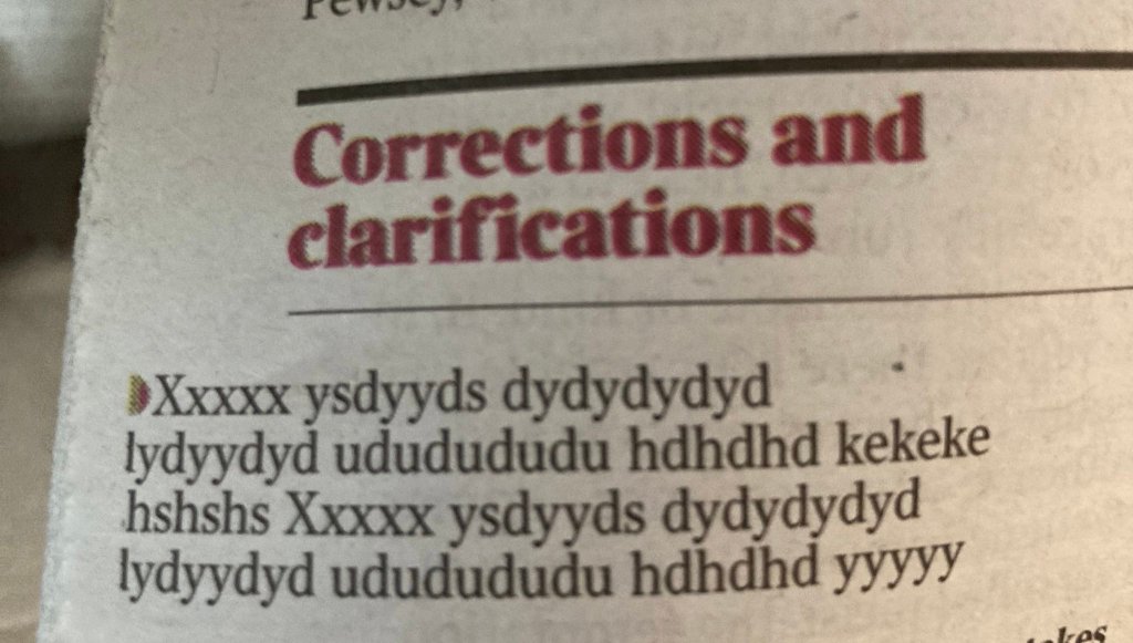
It is also a tense moment if there’s ever a mistake in a crossword clue, and I cringe in sympathy every time one appears in the corrections column. Puzzlers are a vocal and demanding clientele. But when this one appeared last week, I honestly couldn’t work out what was wrong:

Did you get the answer? I did, or I thought I did: the same for both clues. But do you see the reason for the correction? I could only assume it must have been a “tone” thing. Some objection to invoking Mrs Fawlty because of the resonance of Basil’s “yes, dear” disparagements? An unpalatable resonance of 70s sexism as entertainment? But no, it’s more simple and practical than that. It’s because, even though they derive from the same word, Sybil, as in Fawlty or Thorndike, is spelled Sybil, and sibyl, as in female Roman oracle, is spelled sibyl. The problem isn’t political correctness: it’s because spelling 18 across as the name makes it impossible to get 14 down (“Disgusting” (4 letters); answer: “icky”).

Sibyl, then, joins the (I like to think short) list of words I’m not quite sure how to spell. Bill Bryson tells the story that he got his job on the Times subs’ desk in London by correctly betting his interviewer that he was the only one in the building who could confidently spell “Cincinnati”. At one time, I couldn’t spell it either, but I’m there now, after diligent memorisation (one n, two n’s, one t). I can hope to do better in future this time too, if not actually prophesy it.

Also, googling round the subject seems to suggest that puzzle errors are not as rare as one might suppose. In 2006, the high-profile crossword editor of the New York Times, Will Shortz, published a list of all the mistakes that had appeared on his watch to that point (he started in 1993 and is still in the job today). Some of them are simple factual errors, but some of them are just the kind of semi-concealed mistakes that any sub-editor would be proud to spot. These two are my favourites:

Full list here. (I also enjoyed the tubular/cylindrical nit-pick, but that clue about the Uzi would be impossibly vague even if it were correct.)

I’m a believer

22 Nov

Don’t you think it looks just like them? What, you don’t?

In an embarrassing incident in the Tribune’s news section recently, this picture was sent through by the picture desk to illustrate a story about Monkees memorabilia, went to the sub, who didn’t notice anything wrong, then into revise for me, who didn’t notice anything wrong, then to the production editor and duty editor, who didn’t notice anything wrong, then to the newsstand, whereupon almost everybody immediately pointed out that – yes – those aren’t actually the Monkees.

This always happens on large pictures on page three, doesn’t it? Never to little ones in the Nibs. Anyway, these are the four lead actors in Daydream Believer: The Monkees Story, a now little-seen and modestly rated biopic that came out in 2000.

I can’t even claim to have not looked at the picture. I was totally fooled by Davy Jones (George Stanchev), thought Michael Nesmith (Jeff Geddis)’s body language looked convincing, then stared at LB Fisher on the right of the group and thought “wow, Peter Tork looks young”. Not a trace of doubt in my mind. (In my defence, even Variety, while not very taken with the film, was reportedly impressed with the “close replicas of the original Davy, Mike, Micky and Peter”.)

Admittedly, once the inquest has begun, you immediately notice that Dolenz (Aaron Lohr) is perhaps a little less of a lookalike than the others. Also, there’s a distinctly modern-looking car in the background of the picture. Also, if you’re going to get seriously forensic about it, that shop in the background appears to be a branch of the convenience chain Rabba, which operates almost entirely in Ontario. (Although no reason, I guess, why the “prefab four” – as I discover they were wittily known – shouldn’t have been in Canada in the 1960s).

The BBC once broadcast footage of Bob Dylan that turned out to be of a Bob Dylan impersonator. I used to think that might have been because the person who chose the footage was one or even two generations younger than the fans who would notice. But I watched The Monkees myself when I was growing up, for heaven’s sake. All together now, as this blog has said many times, not least to itself: captions have a shorter path into print than any other component on a page.

All sorts of things can go wrong. The agency caption might be ambiguous. The agency caption might be wrong. The agency caption might be right, but nobody has read it closely enough. The revise sub is probably the last person who will read it closely before the readers do. So when you’re revising them, you can’t just be a believer. You’ve got to see their faces.

Pity and error

8 Nov

The Tribune has been running a headline competition in recent months, and with the self-effacing reticence that characterises our profession, I have been showing off shamelessly trying to win it. (Not entirely successfully: because you have to be nominated by your peers to get in, not all one’s efforts bear fruit. On one story about enfant terrible Jake Chapman’s first solo art exhibition without his sibling Dinos, I wrote the kicker “Art brother, where are you?” and sat back in proud expectation, only for it to pass through the revise queue without comment and vanish from sight.)

You would think such competitions would be the pinnacle of a sub-editor’s career – that success would be like winning an intra-office Oscar. But of course they aren’t: copy-editors are not naturally born to triumph. The yardstick that really measures our lives is a much more negative and sobering one: the corrections column.

Perhaps there are some of us who never feel the need to look at them, or read the daily email of shame from the readers’ editor, but on the Tribune’s business desk, the Production Editor and I are riveted to the corrections. They appear on our Visual Planner software on Friday afternoons in the Comment section, at which point work fairly soon stops and we click to view. Even before calling up the preview, you can see on the little page thumbnail how many corrections there are from the size of the box: just a few inches deep, with a reader’s letter underneath? Phew: not too many this week. Filling the whole depth of the column? Uh-oh.

Then we begin reading, nervous of seeing a subject or headline we recognise. “In our recipe for sourdough batons…” Nope. “Mussorgsky did not, as we stated last week…” Nope: Review section. “In our story on British technology startups …” Oh shit. Crushed again by a misconverted currency or even a reporter’s error that we could have discovered with a little more effort, we confess to each other our sins.

My own career low point occurred when an entire corrections columns ended up being filled with errors perpetrated in a piece I had edited. Written by a famously bohemian correspondent in New York about former Vanity Fair editor Tina Brown, it arrived from the desk very late and full of vaguenesses, writerly flourishes and unrebutted hearsay. Foolishly, given the hour, I thought to myself “I can save it!” and tried to fudge or cut as much as possible of the dubious stuff so as not to miss deadline. (MEMO: Never do this. No matter how late it is, if a piece is obviously undercooked and substandard, send it back and have a row with the desk. You can’t “save it”.) Brown rightly complained and it emerged that, in the chaos, I had even contrived to miscalculate her age.

None of our anxiety about corrections is relieved by the emerging phenomenon of what we might call Readers’ Editing as Performance. This blog has fulminated before about corrections columns that have fun picking apart the editorial cartoon or making erudite jokes about the Teenage Mutant Ninja Turtles. It’s all great fun for the people who haven’t made the mistake: and when it isn’t really a mistake at all, even those jokey “corrections” still rankle. That’s why, despite the cock-up being as good as this one – because, you know, the irony – you can’t help feeling a pang for the person who missed it.

(h/t Joe McNally at Horny Handed Subs of Toil)

Zeroes and ones, part 6C (43F)

30 Aug

Journalism and maths – the adventure continues:

Although in fact, here the issue is not really numeracy: it’s a more abstract one of conceptualisation – confusing a temperature of 2.5C with a difference in temperature of 2.5C. A sum has been calculated correctly; it’s just not the appropriate sum. (If global temperatures rise by 36F, even air conditioning isn’t going to help.)

And I’m afraid, at the Tribune, this has happened quite often:

It’s not clear why we struggle with temperature like this when we navigate other conversions successfully and, as has been said elsewhere, sub-editors are capable of making much finer distinctions than this when it comes to language. I think it may have something to do with the fact that the zeroes on the two scales are so far apart and signify different things (whereas, for example, 0 mph and 0 kph signify the same thing, and the scales diverge after starting at a common point).

The classic formula for converting an actual temperature in celsius to fahrenheit is

(<temp in C> x 1.8) + 32 = <temp in F>

and it’s that addition of the constant, the 32, that causes the trouble when you are trying to calculate a difference in temperature. If you subtract 32 from all the erring totals (where given) in the corrections above, you get the right answer (or close to it, given some of the original fahrenheit totals have been rounded). So the correct C to F conversion for a difference in temperature is simply

<temp difference in C> x 1.8 = <temp difference in F>

and similarly the other way, for a difference in temperature:

<temp difference in F> x 0.5555 = <temp difference in C>

In such a critical decade for climate change policy, we may find ourselves needing to do these sums more and more often.

With thanks to the Tribune’s chief revise sub for spotting this one – a man who has seen too many improbable-looking pound-to-yen conversions (really, that many zeroes?) to let any figure in parentheses pass unscrutinised.

More anon

20 Feb

This blog has always had an eye for an odd correction, and this one certainly seems a bit odd:

As we were discussing last time, social media, and the anonymity it affords, is starting to have a noticeable influence on the tone of traditional journalism. One aspect of this is that news is starting to sound slightly less serious, as substantial stories are sourced from revelations published by Twitter users with silly names. But in another respect, the prevalence of pseudonyms on web platforms – including, in most cases, news organisations’ own sites – means that news is also becoming more profoundly anonymous.

Of course, this is hardly a new concept for journalism: some of the biggest stories ever broken have relied on unidentified informants, from Deep Throat to the person who sold MPs’ expenses data to the Telegraph. But in cases like those, although the reader did not know who the source was, the reporter did: and the organisation always had some opportunity to weigh up its informant’s bona fides. In the old days, anonymous sourcing worked because of an implicit assurance offered by the newspaper: we cannot name this person, but you can trust them because we trust them.

The crucial difference between then and now is that, in the case of an online commenter or social media user, it is not always possible to offer that assurance. Indeed, it is likely in many cases that nobody in the news organisation – not the journalists, and probably not even the website administrator – really knows who they’re dealing with. Typically, to log in to a newspaper website and make a comment, you need only give a name (not necessarily your own), an email address (not necessarily one that identifies you), and a date of birth, which hardly narrows things down. Everything you need to join the debate can be arranged from scratch in five minutes without ever making a personal revelation. This is no vox pop conducted on the street, when a reporter stops you and asks you how to spell your name. In this new, deeper anonymity, whether below the line or on social media, your identity is well protected even from the journalist who is quoting you.

Of course, this article was only the Guardian’s “Comments of the Day” roundup, not a major investigation. And of course, many arguments have been advanced about the benefits of anonymity in online forums – the speech tends to be freer and the focus stays for longer on the ideas, rather than the people propounding them. And of course, it’s not factually correct to say LearningIsLife said something when he or she didn’t. But still, the sense of strangeness doesn’t entirely dissipate.

Sometimes, assigning the wrong quotation to the wrong person does make a big difference to understanding, as in this example:

But the correction of attribution between upwthitimustput and LearningIsLife is something that could only really matter to the contributors, not the readers. The audience can hardly be any the wiser as to the authority of the comment, or more informed about its antecedents, if both the contributors concerned are anonymous. And it’s even slightly difficult to understand what’s in it for the commenters themselves: if you’ve opted for anonymity, what does it matter if someone gets your alias wrong?

The one thing you notice

9 Jan

This armchair-continuity-expert thing is getting addictive. Moving on from The Crown to Netflix’s excellent Manhunt:Unabomber – the birth of forensic linguistics in eight parts, featuring Paul Bettany in a beard, Sam Worthington in a suit and Chris Noth in giant ’90s spectacles – the following subtitle screen appears:

Like the costumes and the hairstyles, it all seems redolently in-period. That’s the old San Francisco airport control tower, not the new one that was opened in 2016. The 747 on the right looks convincingly retro in Air China’s old-fashioned livery.  But what about that plane on the left?

The lettering says “United”, but the logo on the tail, an outline globe over a blue background, is the mark of Continental Airlines – or it was, until United and Continental merged and decided, unusually, to adopt United’s name but use Continental’s livery on all its planes from then on. That merger took place in 2010: which means that this pleasingly period-looking footage cannot be more than eight years old.

How did I notice that? Just by chance. As a frequent flyer to the US, I eagerly hoard my airmiles. The obvious way to do that is by always flying with the same airline: that way, the free flights and upgrades come quicker than they would if you were slowly accumulating credit with multiple carriers. The airline I flew with repeatedly over the years was Continental: so I heard about the merger in customer emails, saw the name change on the website, nervously logged on to United’s loyalty programme to check that my airmiles had been transferred.

I had no idea that San Francisco had built a new control tower: I haven’t been there for years. I didn’t know that Air China was painting its planes to look like that well into the 2010s: I discovered those facts on Google. Now that I look into it, I’m not sure that the flowery logo on the 747’s tail is correct for the period either, or that that model of United Airbus was even around in ’95. But all this would have been a closed book to me before. I’m not an expert on civil aviation: the logo on the tailplane was the one thing I noticed.

And editing can be alarmingly like this as well. Internal inconsistencies in copy – variant spellings, bad maths, impossible chronologies – are obvious from the text. Names, dates and places can all easily be checked with other sources. But even with the highest levels of professionalism and diligence, some errors will only be spotted because you happens to know something.

Sometimes, it would need a baby-boomer editor to tell the difference between Bob Dylan and a Bob Dylan impersonator before broadcasting footage of the latter on the BBC. Sometimes, it would need a Gen-Xer to know where Luke Skywalker and Obi-wan Kenobi first met (hint: not in the cantina). These are the kind of facts that have to be known, rather than checked: there is scarcely time in a daily news routine to compare photographs of musical pioneers or rewatch Star Wars, just in case.

And sometimes, you might need a youngster – someone who understands that users change their names on Twitter for all sorts of reasons – in order not to trip over something like this:

The artist Cowabunga

16 Aug

If you’re not sure if you’re reading a broadsheet or a tabloid, check the corrections column. If you see a correction like this, you’re reading a broadsheet:

We confused the endings of two Bresson films in the article above when we said that the donkey hero of Au Hasard Balthazar died to the accompaniment of Monteverdi. The soundtrack to Mouchette’s suicide in the film of that name is Monteverdi, while Balthazar dies to the accompaniment of a Schubert piano sonata. This error has been corrected.

This is mother lode for a broadsheet readers’ editor: French directors, baroque composers, fine distinctions.  It can’t always be that way: too often, this level of expertise is lost in the quotidian struggle to correct homophones and pacify libelled entrepreneurs. But when there’s the slightest glimpse of home ground – a classical reference twinkling in the morass – that unique combination of erudition and patience comes to the fore:

In a feature about the return of the TV series Robot Wars, we said the first season “featured … robots with names such as Killertron and Recylopse”. The correct spelling of the latter is Recyclopse, being a play on the facts that the robot was made almost entirely of recycled material and featured one large eye, like the Greek mythical giant Cyclops

And you need patience, because some people’s grasp of 15th century art just makes you roll your eyes:

A film review on Friday about “Teenage Mutant Ninja Turtles: Out of the Shadows” referred incorrectly to the turtles’ names. Three turtles are named for Renaissance artists whose major works included paintings, not four. (Donatello was a sculptor.)

Secrets of style

16 Feb

You should always put right a factual error, of course. But would you really issue a correction in the paper for not having followed your own house style?

Screen Shot 2016-02-08 at 17.44.21

This correction, in the Guardian earlier this month, is purely a matter of preference, not error. Style guides sometimes deal with issues of fact – warnings about, say common geographical mistakes – but this isn’t one of those times. This is just an absence of quote marks that doesn’t seem to affect the sense of the sentence; something that only someone who had read the style guide would even know was wrong.

Admittedly, the Guardian’s guide is publicly available online for those who take an interest, but it’s not as though the reader’s editor feels compelled to apologise for every lapse in consistency. For example, Guardian style calls for “focused” with one “s”; it sometimes appears with two, but there’s never been a correction about it.

But the rest of the column makes it clear why these quotes matter. The Guardian has been a supporter of the Living Wage campaign, which urges employers to offer an hourly pay figure somewhat higher the statutory minimum wage. In the 2015 budget, George Osborne introduced what he called a “national living wage”, borrowing the campaign’s phrase but not fully winning its approval: his proposal does not include a higher rate for London, is not set according to a cost-of-living index, and came alongside a series of benefit adjustments for the lower-paid that were nowhere contemplated in the campaign’s calculations.

It is therefore the campaign’s, and the Guardian’s, position that the “national living wage” is not actually a living wage, but a rebranding and increasing of the minimum wage. So the style guide uses quotes to indicate that the phrase is not the paper’s but the government’s: it acknowledges the official title while maintaining its distance from it.

That means the correction is acknowledging not just a failure in neatness or consistency, but something bigger: a lack of critical thinking, a lapse in the acuity one would expect from the paper in its political reporting. A piece of parliamentary rhetoric has found its way into the paper unchallenged. It’s an apology, in effect, for seeming to be credulous.

Of course the British media’s openly displayed party preferences play a large part in the setting of style like this: the Telegraph, at the other end of the political spectrum from the Guardian, sees no reason to use quotes around the term in news coverage. It’s hardly unusual to see Fleet Street pick a fight over a phrase.

But it does show what consistent style can achieve, in addition to keeping a lid on misspellings. Style guides don’t just contain rules, they contain thinking: tiny position papers that encapsulate the reason for a choice on a sensitive issue, whether it’s between undocumented or illegal, Derry or Londonderry, Burma or Myanmar, refugee or migrant. The issues are unpacked once, considered, then formulated into a rule rather than opened up for debate every time. So then, when you follow the style guide, the paper’s worldview comes with it: the mosaic of rulings not only keeps the writing tidy, but infuses the text with the spirit of the paper. With a good style guide, you don’t need to read the leader page to know roughly where a newspaper stands: its choice of words on any page will tell you.

Snap judgments

6 Jan

The web production editor writes:

A reader has pointed out that generally when a Greek place name begins with Skala eg Skala Kalloni on Lesbos, the skala part means “harbour” or “landing place for boats” and it is used to distinguish it from a nearby inland town of the same name (minus the “skala”) eg Kalloni on Lesbos.

As such, please avoid just using the name Skala to refer to a town because it is nonsensical (unless, of course, that is its only name).

The caption on the agency photo on page 6 today referred to refugees arriving at the village of Skala on Lesbos. This was all the information provided by the agency so if we can’t verify the full name of the village it is better to avoid using it altogether if we can. (Emphasis added)

Mistakes in photographers’ caption information are a problem. They bypass the experienced eyes of the writer of the article; even when a photographer accompanies a reporter on the job, the reporter rarely sees the pics and almost never the caption details. They also often bypass the commissioning desk: news editors will try to familiarise themselves with their picture options when briefing the page designer, but not in every case; no one consults the head of foreign news on every downpage cutout or mugshot. And at the Tribune, with the amount of news being edited and published online every day, sub-editors have direct access to the photo library to select their own pictures, so many photographs launched on to the web even bypass the picture desk.

The result is that photographs and their captions have a shorter route into publication than any other piece of content except the Sudoku puzzle. In a fact-checking process that runs from reporter to news desk to sub to revise sub to (if you’re lucky) proofreader, the caption skips the first two stages altogether and, on the web, gets published after the third one, to be revised later on.

That explains why newspaper captions can tend to echo the present-tense descriptive style peculiar to agency photo information (“a man is seen waving …”) and their all-too-familiar verb choices (“celebrates”, “gestures” etc); captions get less polishing than other parts of the body text. It also explains why so much classic corrections-column material arises from how photographs are treated in the production process.

But when the error originates with the agency, what little protection there is against error disappears. If, as in the uncomfortable case of this Guardian correction, a reputable photo agency sends out a picture of a private individual who has been thrust into the news, and it turns out to be the wrong person, it’s basically uncheckable:

Screen Shot 2016-01-05 at 23.01.53

Just as a sub-editor can be the single point of failure on picture choice and caption-writing, the photo agency is the single point of failure on veracity. Very few people except those acquainted with the individual in the news will know it’s a mistake, and not many of them are likely to be in the newsroom, so the first person to hear about it will probably be the readers’ editor. In the Guardian case, there was also internal miscommunication over a recall from the photo agency, but in any situation where there is a significant delay between release and retraction, the picture will be all over the web, and in Google’s caches, long before remedial action can be taken.

Many things have to fall into line for a mistake in raw copy to get all the way through to print: a misapprehension by the reporter, a fumbled effort at clarification from the desk, a sub who lets through an ambiguous paragraph, a revise sub in a hurry on deadline. But a mistake over an online photograph can happen, as it were, in a flash.

Due to a cartooning error …

21 Jul

Some corrections make one hang one’s head in shame:

Screen Shot 2015-07-20 at 13.27.05

Others, however, not so much:

Screen Shot 2015-07-20 at 18.16.54

Every four years, thanks to the generous human resources policies at the Tribune, the chief sub gets a sabbatical of between four and eight weeks and it falls to me, as his normally carefree deputy, to actually earn my salary and take the reins of the business section while he’s away.

When you’re the chief sub, no matter how big the paper or the pages you produce, you feel personally responsible for all of it. In fact, the Tribune’s weekly biz section is small enough that you can lay out all the pages, pick all the photos and revise all the articles yourself, if they’re filed in good time. But that means the pain is all the sharper when you discover something that passed before your eyes popping up in the corrections column.

The first mistake was just infuriating, especially when one prides oneself on one’s punctiliousness in compound hyphenation; but it is an embarrassing classic of the genre, especially as it inadvertently touches so closely on a real issue of ethnicity and opportunities.

The second one, though … I’m not entirely sure there can even be a mistake in a cartoon. An apology for a lapse of taste, certainly: but a factual correction?

Presumably, this isn’t a serious undertaking to observe strict realism in all visual jokes – because once you start correcting metaphors, where do you stop? The cartoon also shows Jean-Claude Juncker at the wheel of a vehicle bearing the livery of the “EU Euro Police”: to clarify, perhaps we should make clear that there is no such organisation. Nor, to the paper’s knowledge, has Alexis Tsipras ever been the victim of a rear-end collision near the offramp to “Grexit” while driving an overloaded hatchback painted in the colours of the Greek flag.

In newspapers that never publish corrections unless forced to, there is never any need for a clarification to be other than brief and to the point. The existence of a regular corrections column in every issue of the paper, by contrast, is possibly the single most significant indicator of editorial probity a paper can make. But it does mean that the column can suffer from the same problem that afflicts the rest of the paper: that it has to be filled, no matter how much or little material there is that day.

Many readers’ editors have bylined weekly slots for longer discussions about grey areas or lighter matters, but the corrections column itself  – 200 or so words, five or six days a week, rain or shine –  is a 1,200-word job that has to be delivered no matter how few readers have complained.

So one thing that’s tending to happen is that the ambit of the column is starting to widen. The Guardian has taken to occasionally correcting instances where house style has not been followed, even though the word that was used instead is not incorrect, such as this example involving ‘wrack’ and ‘rack’:

Screen Shot 2015-07-20 at 18.17.07

(“Rack” is greatly to be preferred in this case, of course, and I would always delete the “w” myself. But both spellings for that definition appear in Collins, which means that it’s not a homophone but a variant, and arguably not a “mistake” at all – more an internal point of interest for staff.)

And, because the never-ending roll of errors can be depressing to recount, the other thing that’s tending to happen is that levity and tonal variation are being introduced: here, for example, the Guardian introduces some tennis-themed kickers to its Wimbledon corrections:

Screen Shot 2015-07-20 at 18.59.57

It’s all harmless fun, I suppose – and I’ve never yet seen anyone be foolish enough to make a joke over an actual apology or retraction. But it does indicate that something is starting to change – that the Fleet Street corrections column is moving from being an innovation to being an institution: part of the show, almost.

In a newspaper culture whose traditional response to mistakes was silence and defiance, that might be something to celebrate. But for an appointed outsider like an ombudsman, whose independence, even from the editor-in-chief, is supposedly total, it might be something to be wary of too.