Tag Archives: web editing

Attack of the 50-foot headline

20 Dec

We used to be disciplined about this. For headlines, the rule was three and three in mobile view – that is to say, three decks of headline and three decks of standfirst, and no more, when looking at a Tribune article on your phone.

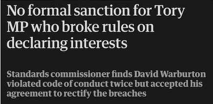
That’s pretty tight, so I used to allow myself to go three and four or four and three (OK, sometimes even four and four).

But now look what’s happened.

The Audience department has started brightly saying things like “it’s sometimes worth going slightly longer on a headline to add a kicker that punches up the drama!”. And with just that brief exposure to SEO radiation, the town’s gone crazy and giant monstrosities have BROKEN LOOSE.

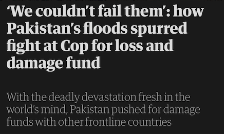
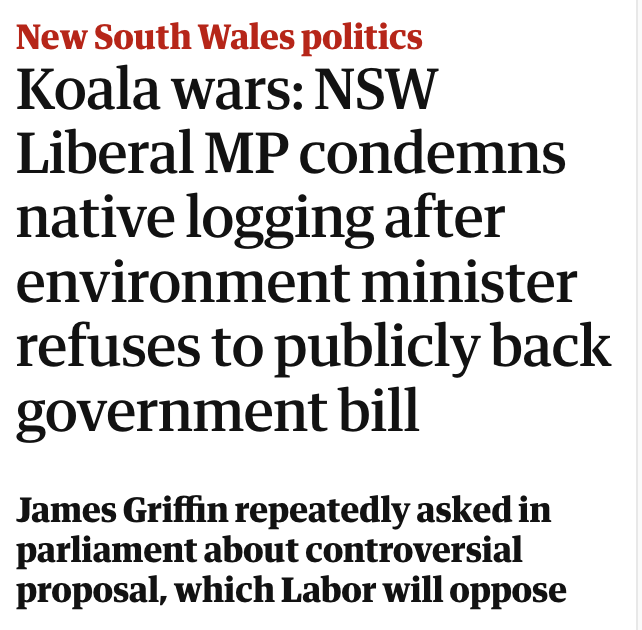
Some of these headlines are literally double the height of what we restricted ourselves to in the old days. The thinking used to be that you would want a reader to see the whole headline and the standfirst, at least, on the same screen, to engage them before their attention wandered. Now you have to scroll just to get to the end of the first element. Long headlines may be able to punch up the drama, but perhaps not if you can’t read to the end of them on anything smaller than an iPad.

And that’s before you even consider the issue of the view in desktop mode. Many fewer people read the site on a computer than on a phone these days, so the rule is “make it look good on mobile”, but the appearance on the big screen still matters. The way the Tribune system is set up, there’s a sweet spot at about the three-and-four length that comes out neatly as two-and-two on desktop. There isn’t a built-in length guide in our software, but after a while you get used to hitting it, and making sacrifices to avoid creating, say, an orphan on a third deck. Now it seems they want us to pack the furniture with all the interest as well as the search terms, and hang the look or the length.

If you have any involvement in online media, you soon learn that search engine optimisation goes in phases. Pure SEO is, when you think about it, an unusual job – in effect, analysing and guessing how a private company’s proprietary algorithm might be working. Being a professional Google-watcher has its tribulations: for example, it used to be thought 15 years ago that repeating search terms in the headline and the standfirst was the key to being seen. Then it was thought that the standfirst might matter less for visibility than the main caption, and so on.

However, as the SEO role has expanded into what is now called “Audience”, it has engaged more widely with social media and news aggregator services, and is becoming – somewhat to sub-editors’ chagrin – a general headline-critiquing service in which social impact and readability are judged alongside search-friendliness. The rules are changing, again, and as one’s age and inflexibility increases, the harder it is to keep up.

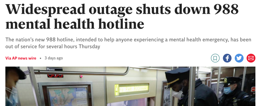
On the other hand though, who’s to say they aren’t right about this? Which is the most successful British newspaper website of them all? Mail Online. And how long are Mail Online headlines? Well, er …

Eight decks, with an orphan. In desktop view! As well as a four-deck standfirst. It makes us look like amateurs. It also tramples all over the idea of brevity as a virtue in journalism: but maybe brevity was only a virtue when there was limited space, in the days of print? This is long, rambling and takes a whole breath to read out loud, but it contains every single likely search term relating to the story, and there is no shortage of space on the internet. Maybe length is not the issue at all any more. Maybe online visibility is the only thing that matters?

As the holidays approach, Ten Minutes Past Deadline has thrown some presents in the boot and is joining the queues on the M25 for its short peri-festivus break. Happy Christmas to all, and see you in the new year.

Anglophone emergency

6 Dec

This blog usually has fun decoding the confusions of agenda and language that international anglophone news throws up – human “coyotes”, angry cassowaries chasing “blokes”, and so on. But this ambiguity is potentially more serious.

This summer, the US launched a new suicide prevention hotline number, 988. There have recently been technical problems with it that forced it offline for a period. For some reason in the past few days – perhaps as a result of this news – some British Twitter users started copy-pasting and retweeting boilerplate text to raise awareness of the number as if it were a service in the UK, even though, of course, it isn’t, and that number here connects to nothing.

The confusion does seem to have spread,

and to have reached the point where where Mind, the prominent British mental health charity, was deploying its social media team to refute it:

Now Joe McNally at Horny Handed Subs of Toil suggests that a news story on the Independent website in the UK about 988’s technical problems may have fuelled some of the confusion.

The Independent is not one of the British news organisations determined to break into the US market – it’s UK-focused – and yet this story that it published last week seems to be a straight Associated Press wire story for an American audience. The headline, the opening paragraphs and even the photo are identical to the original version on the AP site.

As McNally says in his post, “for obvious reasons, sharing false information about emergency mental health services has enormous potential to cause serious harm”. And he rightly points out that here,

“nobody thought to make it clear at any point in the copy that this is an American story. It mentions a US health agency and a US health official but it’s full of references to ‘national’ services and ‘the nation’ without ever once explicitly stating *what that nation is*”.

He also says that several British people linked to this article to defend the information they had shared, because it’s so ambiguous about location. Arriving at the story almost 48 hours late, and with the rebuttal effort in full swing, I can’t now find any tweets that explicitly do this (although it may have happened on other social media). But even without a social media kerfuffle, the potential for this article to confuse, when presented on a UK site without any context, is clear. (Look at the bald headline in the screenshot above, on a site belonging to a British newspaper with not much of an international profile. Where would you conclude this hotline service might be based?)

As you read it closely, you see clues: 911, which is mentioned as “the emergency line”, is of course not the UK’s emergency line. Britain has no “Department of Health and Human Services”. The number was out of service “for several hours Thursday”, not “several hours on Thursday”. “Counselors” is given with one L, not two. But these are things that an editor would notice, not necessarily a member of the public.

At the Tribune, we have a lookup table for crisis hotline numbers in our three markets – the UK, the US and Australia – and add them as footnotes to relevant stories according to which audience the piece is intended for. In the UK, the number we give is 116 123, for the Samaritans. But as we have discussed many times on the blog, content intended for one market has a way of leaking across the website and being found by readers abroad.

That’s why the Tribune’s audience and SEO team, despite their rapacious appetite for clicks and sensation, still insist on us making clear in every headline or standfirst which country the news we report is taking place in. A footnote at the end is all very well, but the word “American” in the Independent’s standfirst here would have killed off the confusion at source.

Observing from outside, the article gives every impression of having been auto-launched without editorial intervention. However, if you read it word for word against the version on the AP site, there are some differences. This paragraph appears in the AP version but not in the Indy version,

“Veterans who are looking to reach the helpline can call the Veterans Crisis Line directly at 877-267-6030. The outage is also affecting the Substance Abuse and Mental Health Services Administration’s Disaster Distress Helpline.”

and this additional information appears at the end of the agency’s version too:

“In a statement on its website, the company said it is ‘experiencing an incident that is impacting production across numerous systems’ and is ‘working diligently to restore service.’”

It’s not entirely clear why this is so. If these are the interventions of an editor at the Indy, then it’s worrying that they made those emendations but not others that would have clarified the story fully. (Also, why would anyone delete the contractor’s statement at the end?) It is perhaps more likely that these are additions from a later write-through by AP reporters, and that the Indy fetched the story for its site before they were filed; obviously the AP’s own site will always have the fullest, latest version.

If the latter is the case, then the article would indeed seem to have published with minimal human intervention, which calls to mind the complaint voiced for years by the old Testy Copy Editors website: “Hundreds of newspapers run AP completely unedited!” If that was a problem in the old days of American print, then it must be even more so now that hundreds of websites – and not all of them in the US – are running AP unedited too.

h/t: Joe McNally

Feel the need for speed

24 May

Wow, Tom Cruise flew himself to the Top Gun premiere in a helicopter!

Oh no he didn’t!

Oh yes he did!

In fact, it says here he “slowly descended it”:

The trouble with reading an article when the Mail Online repair crew is halfway through fixing it is that it can be difficult to work out what’s going on. Pieces get rushed up, problems get spotted, angles get tweaked, but it doesn’t all happen at once, and some things don’t get put right for hours, or at all.

This article, on the premiere of Top Gun: Maverick in San Diego, went live at one in the morning in the UK

– or 5pm on the day of the event Pacific time, so very promptly indeed, and one or two spur-of-the-moment misunderstandings are to be expected. Obviously someone has been back in to the body text to remove the claims about Cruise doing his own piloting, and toned down the article headline

but, as of 9:28 the same morning, the video caption, picture caption and homepage headline remain uncorrected.

One or two other things don’t seem to be quite right either. Top Gun came out in 1986, so this is all happening 36 years later, not 34 years later as the headline claims. Also, at one point it says of Cruise’s co-star Jennifer Connelly:

But Connelly wasn’t in the original Top Gun. The character she is now playing, Penny Benjamin, was mentioned in the first film but never shown – she is the unseen admiral’s daughter in the line “You lost your qualifications as section leader three times … with a history of high speed passes over five air control towers and one admiral’s daughter!”

However, a further four hours later, someone on the Mail has made another flyby

– it’s not clear why it took that long to get round to it, but perhaps the pattern was full – and things have improved considerably. The adding-up in the headline is fixed:

all traces of misinformation about Cruise flying himself in have been expunged:

and significant additions to the text now help you understand who many of the people in the 96 (96!) photographs embedded in the piece actually are.

Still and all, this has taken 14 hours of on-off editing, in public, to get right. I understand the urge to rush something up and be first with the news – you don’t want to hold on so tight that you lose the edge – but would 40 minutes of extra editing time really have been a disaster when your unique saturation coverage is bound to draw a big audience anyway?

And, as we have seen before, some of the more-haste-less-speed inaccuracies have survived even this rewrite; Connelly is still, in this version, “reprising” a role she has never previously played. Also, as part of the improvements to the piece, there is now a fact box about the helicopter itself – only it’s in such a raw state that it seems to have been downloaded straight from the Notes app on someone’s phone.

And so the cycle of improvement can begin anew – or it could if the repair crew, going Mach 2 with their hair on fire, hadn’t long since been forced to move on to other things.

Slightly missing links

26 Oct

The trouble with hyperlinks is that, even though they don’t mean to, they add emphasis. They are, after all, in a different colour to the rest of the text, and often underlined. They stand out. Which means you need a bit of an ear for the rhythms of a sentence when you put them in:

“Why at the end of it” stops a little short of the end, as it were, as does the link to the obscure … provision. And although “Dominic Cummings claimed” is fine, “said Johnson told” unfortunately avoids highlighting either of the two salient parts of the sentence: Ian Paisley Junior and the idea of the story.

These are just infelicities of emphasis rather than meaning – rather like the Express’s erstwhile habit of putting sudden capitals in the WRONG place. Occasionally, though, an off-target hyperlink can create more peculiar effects, like this:

Here, even though you’re supposed to overlook these links, it throws you. Semantically, the verb phrase that begins “bring prosecutions for killings” finishes at “to an end”. But the emphatic red text stops three words early and encourages you to think the phrase has come to an end as well. So for a moment you think the government is planning to start bringing Troubles prosecutions again, not stop them.

Of course, you work it out in the end. But we’re supposed to be saving readers as much work as possible, so, along with colliding English-language news agendas and launching without revising, this is another thing old print lags have to get used to. In the old days, we would never underline anything at all; now we do it by accident.

Never wrong for … oh

8 Dec

It’s easy to forget things about people – that actor you liked, what year she died, what show she was in, what character she played. Or, as here in the Mail, what her name was.

That surname is given consistently throughout the text (although, interestingly, not in one caption). But the Mail’s readers were immediately on the case: it should be Chambers, not Chalmers.*

Previously, we have observed the Mail’s revise desk hastening to intervene after a faulty story has gone up, but they couldn’t save the day this time. Not that they didn’t stop by: the article was published at 16.08, then updated at 16.29, then again at 17.50, then again at 21.18. But each time the largest error went uncorrected, to the increasing dismay of the commenters below:

This is not to rejoice at the presence of an error in a rival publication. In fact, something similar happened to a newspaper very close to this blog years ago, when a notable media executive’s name was got wrong, with total consistency, all the way through a story about his career. But in the era of the internet, there is an extra pair of eyes scouring for this kind of error – the readership’s. And now they can let let you know when something’s amiss. Or they can if you’re listening to them.

At the Tribune, there is an industrious Office of the Readers’ Editor, charged with representing the newspaper’s audience back to it in matters of complaint and error. They discharge this duty with impressive assertiveness and what sometimes feels like, but surely cannot be, glee. The heart sinks as an email arrives beginning “CCing subs: I think the reader might have a point here …” above a brusque message skewering another howler that got through the newsdesk and two layers of editing.

The same is true of comments. As the tide of vituperation rolls on, we are less enthused about this kind of interaction than we used to be, but we still allow comments on many pieces, and when we do, they are moderated after posting. The Mail takes a different approach – according to its FAQs, comments are either premoderated (that is, checked before being allowed on the site), or, more frequently, not moderated at all.

Even unmoderated comments can be policed to some extent by other users by using the Mail’s “upvote/downvote” function. Unfortunately, the posts pointing out the Chalmers/Chambers error don’t appear in either the worst or the best top 10 as voted. Lost in the middle of 100-plus contributions, many readers may not see them – and, in this case at least, no one from the Mail is looking at all.

*Also, of course, the “late actress” did not play a “much loved actress”: Alice was a verger. You may also feel that there are some commas missing in that sentence, and perhaps one too few in the first part of the standfirst.

Worth a thousand words

18 Apr

You can almost see the brushstrokes:

When you’re adding a picture to a news story for the web, of course you have to write a caption. But you will also be asked to create some “alt text” – a brief, embedded description of the photograph that is invisible under normal circumstances, but may appear if you hover your pointer over it in the browser. By far alt text’s most useful function is that it can be read out loud by a screen reader – a piece of software that translates a web page into the spoken word for visually impaired computer users.

That means, of course, that you probably can’t just cut and paste the caption you’ve just written: this is no place for snark or commentary. If the photo is of the Alabama lacrosse team celebrating after breaking an 0-for-7 start, your caption may say “Tide: off the schneid”, but the alt text needs to say “Alabama lacrosse team players celebrating”.

And if that’s true for photographs, it’s equally true for cartoons. What’s being portrayed may be a little more, er, unusual, but that doesn’t alter the nature of the task: you still have to provide a faithful verbal description of what the illustration shows. Have confidence, and the muscular metaphors of the political cartoonist will come to life in the mind’s eye almost as surely as if they were looking at the original watercolour.

You could practically display them in a gallery:


The web is where the work is

17 Aug

Screen Shot 2015-08-16 at 18.23.35

John McIntyre writes:

Today, I have to tell you, working as a print-only copy editor is not a job with a future. A tremendous amount of content goes online, and it must be produced, formatted, and, yes, edited. If you can’t or won’t master these skills, the paper will find someone who will. This situation is exactly parallel to the introduction of editing for print on computers thirty years ago.

He’s right. There is concern in some places that the function of the website – hitherto, perhaps, an adjunct to an established newspaper – is starting to encroach on the production of the main event: printed pages. That’s certainly what’s happened here at the Tribune. Where once the uploaders meekly fished into a pool of print stories and put a few of them on a website as an experiment, now the whole day is arranged for the production of rolling live news online, and the print newsdesk is the one unobtrusively harvesting stories for the paper that have already been published for hours.

That sounds depressing: but it isn’t. In fact, it’s good news. The success of internet news is far from the worst thing that could have happened to copy editors.

Twelve years ago, before it was clear that newspaper websites were going to work, news publishers’ proposals for survival revolved around taking costs out of the print operation. There was a distinct prospect – which has become a grim reality in many places – of print subs being bypassed altogether for a model in which reporters typed straight onto pages drawn up by designers, and either wrote their own headlines or wrote headlines for each other. Redundancy has beckoned for thousands of subs, particularly in the US and the British local press.

Now, the economics of newspapering are far from being solved, and the gaps in some balance sheets are as bad as they ever were. But the spectacular audience success of news websites has presented some copy-desk managers with an even more pressing problem: suddenly, there’s just so much work to do.

Why? On a typical print paper, a designer takes care of the pictures, worries about where the adverts sit in relation to the editorial, and talks to the graphics desk, while the sub just takes care of the text. The visual work and the textual work are divided. But on the web, there is no designer for the article – or, to look at it another way, the webpage – that you are working on. Yes, the basic web layout will be a template: but you, the copy sub, are now the one flicking through the photo library, navigating round the downpage pop-up ads and wrestling with the embed codes for the bar chart, before you ever get to the headline and the text. On the web, you are the editor, the picture editor and the designer.

This transfer of emphasis from print to web has had another consequence too. When the paper was the flagship, all the management attention and agonising – over photoshoots, headlines, word counts, look and feel – was directed to the print pages. This was the period when the web was seen as being cheap and easy, quick and dirty – a headline, some text and maybe a pic semi-automatically ported into cyberspace. But now, as the website itself becomes the calling card of a news organisation, that attention is getting focused online. We have started to see the emergence of elaborate internet-only showpieces like the New York Times’s “Snowfall” or the Guardian’s “Carbon Bombs” – productions as intricate and labour-intensive as the most impressive double-page graphic. The management at the Tribune has now explicitly asked for more production time to be taken over web stories, to furnish them with extra pictures and other display items.

What does that mean? As an experiment, below is a representative sample of articles, ranked in length order, from my last two news shifts on the Sunday edition of the paper. I timed how long it took me to edit them for print, then stopped the clock and restarted it to find out how much extra time was needed to prepare the same article for the web.

The old production system at the Tribune, which we still use for the Sunday edition, is ideally suited for this experiment, because it’s an integrated print-and-web system that prepares articles for both formats. (Production on the daily edition, by contrast, has now split onto two entirely separate platforms.) Working on a Sunday article naturally breaks itself into a two-stage, print-then-web process. You edit, cut the copy and write the furniture just as you would for a print-only paper, with the only proviso that any copy sacrificed for fit but otherwise decent is put into ‘web-only’ mode, cutting it from the paper but not from the internet.

Then, after you’ve finished the article for print, you

  1. Create a separate suite of web furniture (headline, standfirst, trail etc) based on your print furniture, rewritten as necessary to improve search-engine optimisation.
  2. Add a picture to the web article from the electronic photo library and write an Google-friendly caption.
  3. Find and embed further pictures in the body of the text (about one every 600 words or so) to break up long articles.
  4. Create a URL slug (the part of the web address that comes after the main site name, thus: http://www.thetribune.com/this-bit-is-the-slug), based on your headline.
  5. Add reference tags (usually seven or eight, selected from a large database) to the article so that it can be indexed by author, subject-matter and section on the website.
  6. Preview the webpage for appearance, and check your new furniture for widows and orphans (sometimes it takes two or three attempts to get it looking neat).
  7. Clear your search-engine optimisation efforts with the audience team, who will advise on what popular terms ought to be appearing in the headline.
  8. Launch the article.

Here’s what I found:

Screen Shot 2015-08-16 at 18.23.35

The lengths of time spent print subbing vary as much as you might expect: from an hour and a half for a 1,400-word double-page spread with all the trimmings down to less than 10 minutes for a single-stick news story with a one-column headline.  But the time taken to web an article after subbing it varies much less: from half an hour for the big piece (most of it spent on picture research for the additional photos) down to 12 minute for the short story. There’s an irreducible minimum of work needed to get an article online, no matter how insignificant it is: you have to follow at least seven of the eight steps listed above every single time. In fact, as the table shows, at below the 500-word mark, the time needed to web an article starts to exceed the time needed to edit it traditionally. In other words, short news stories now take more than twice as long to prepare as they used to.

The editor-free, reporters-typing-onto-pages model, if it was ever going to work, might have worked in an impecunious non-digital era where to fill two text boxes was to finish the job. But that’s not how it is on the web. The web needs work: work that is too time-consuming and technical for a reporter to do. And that’s why copy desks that embrace the internet may actually be good news: because in cyberspace there’s more work to do, not less.