When this blog reached its five-year anniversary in 2018, I wrote a summary of the conclusions it had reached so far, and I vaguely thought at the time that, should it run for another five years, that might be a good time for a pause. Now we’ve reached that point – Ten Minutes Past Deadline is 10 years old this week! – and it does seem to be the moment to take stock.
Looking back at the five-year anniversary post, I discover that the blog still essentially agrees with itself in its attitude to the importance of editing, the complexities of online news as it expands into the anglosphere, and the nuanced importance of the role of formal English. The standard of mathematics in newsrooms has not improved over the past five years, and the corrections columns remain as embarrassing to people in our profession as ever. In fact, this is the problem: the blog has settled, as blogs tend to do, into a series of themes, and for a while now has been incrementally exploring them, rather than breaking new ground. It is, perhaps, getting a little repetitive.
So it’s time for some major mental engineering work: tracks of thought will need to be pulled up, sleepers will need to be replaced and some much-needed intellectual ballast laid down. Ten Minutes Past Deadline is not closing – blogs never really close – but the pace of updates will be slower, and motivated more by new thoughts, when they come along, rather than the rehearsal of old ones. Hopefully the work will result, like the replacement escalators at South Kensington, in a less juddery experience for customers, and hopefully will not take as long as that project seemed to.
And, as was the case five years ago, I remain always grateful for the blog’s readers. The visits, the engagement, the comments and the retweets are what make blogging worthwhile, and the content here has always been greatly enhanced by the contributions of others. I hope that we will be back soon with more. Until then, tickets remain valid via all reasonable routes and we would like to apologise for any inconvenience this may cause to your journey.
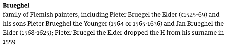
I regret to report that, after years with no serious incidents, someone has stumbled on to the biggest booby trap in the Tribune’s stylebook and set it off. A member of the newsdesk, having seen a piece on a Flemish master go up on the website, innocently emailed to say: “Hi, please can we commit to either Bruegel or Brueghel in this? We’ve got a bit of both at the moment.”
Well, experienced arts subs will know what is coming next. The web production editor did the kindest thing he could, which was simply to email the style guide entry to him without comment. It reads as follows:
Yes, indeed. It’s not just that the spellings are intrinsically tricky. It’s not just that there are two Pieters, the Elder and the Younger (as well as Jan, who although a son of the Elder, is also an Elder himself). It’s that the older onechanged the spelling of the family name halfway through his life, but the younger one didn’t.
What chance do you have of deducing that if you don’t happen to know it? To my mind, following the inconsistency that the rule demands results in a gnomic hypercorrectness that baffles readers (and the newsdesk) – except that this is unquestionably what happened, as Brueg(h)el’s signed canvases testify. What to do instead? Are we going to call a Bruegel a Brueghel, when we would never dream of attributing a Jefferson Starship album to Jefferson Airplane?
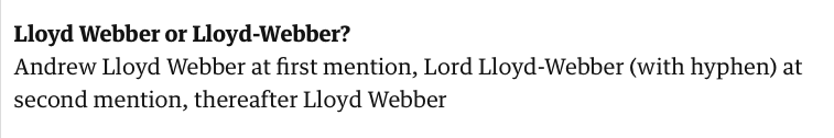
It’s the only spelling I know that needs to be checked against a calendar as well as a biography, and that’s what puts it slightly ahead of the second biggest booby trap in the Tribune’s stylebook – the Lloyd Webber Rule.
Andrew Lloyd Webber (thus, no hyphen) has a double-barrelled name. He was ennobled in 1997, and the rules of the House of Lords require that all compound names be hyphenated for the purposes of a title, whether they usually are or not. He is therefore, formally, Lord Lloyd-Webber of Sydmonton.
Also, strictly speaking, as all British sub-editors know, if you are using a lord or lady’s title you should not use their first name with it (so, eg, you say Lady Rendell or Ruth Rendell: not Lady Ruth Rendell).*
In that light, our style on peerages demands three things:
(i) That the peer in question be given their full name only at first mention, rather than their honorific, for absolute clarity of identification.
(ii) That the honorific then be given at second mention.
(iii) That, in the egalitarian spirit of the Tribune, all persons of voting age (with rare exceptions) be usually referred to by surname only, no matter how honoured they may be. This rule even applies to peers. So, for example, the correct style for Laurence Olivier would be Laurence Olivier, first mention; Lord Olivier, second mention; Olivier, third and subsequent mentions.
So if you put the House of Lords convention together with the Tribune’s style guide, you get the Lloyd Webber Rule:
Hyphenating an unhyphenated surname on second mention only? Now that’s what I call a rule.
*Unless they are the younger son of a duke or marquess, obviously! Ah, if only the Telegraph style guide were not now behind a paywall; what a guide that was to the minutiae of aristocratic convention.
It appears even Glenda is having a bit of trouble with her subeditors this week:
But it’s hard to decide which is more unlikely: that a mere member of the copy desk would criticise the work of one of Fleet Street’s brightest stars, or that a subeditor – who, as a group, shall we say, tend to be a little older than their colleagues – wouldn’t understand a reference to a 1970s film (really, any 1970s film).
Columnists are not, as a rule, inclined to have production functionaries overrule their jeux d’esprits; they are more lightly edited than any other writer, because the quality of their prose is what’s earned them the job, for gawd’s sake???! There is a presumptive hands-off rule for several star writers at the Tribune (not one that I agree with – it is this blog’s position that everyone should be edited, sensitively, and that silly mistakes just spoil a joke), and in any case it would be for the columnist, not the subeditor, to decide what references were culturally salient.
Given the international decline in copy desks, one might be tempted to say that there are no millennial subeditors anyway. That would not be true at the Tribune, which still proudly invests in subs and as a result has a desk that ranges in age by almost 50 years – ideal, in theory, for catching almost any generation-specific error that might elude a colleague. It’s just that the younger ones have the good sense, by and large, to work on the website, in social media and in video – channels that may still offer them employment into the future – and leave a group of increasingly grizzled Gen X-ers to grow old with the paper.
However, that didn’t stop this headline appearing on the website:
A cultural reference to The Life of Brian? Hard to believe a boomer didn’t write that: you’d need to be in your 60s (NOTE: or not – see comments) to have seen that the first time round at the cinema. Maybe Glenda is right: maybe 1970s films are a universal frame of reference that speak to all generations, in which case I’m in prime position to capitalise.
Or has this reference just sailed over the heads of most of our younger online audience, because it’s just too “old”? I don’t if know I feel lucky, or whether I’ve got a bad feeling about this.
Woe betide the editor who moves the crossword: this is an axiom you will hear repeated in the corridors of power at every British newspaper. Decades ago, the Tribune reprinted the entire leaked text of a speech by Khrushchev denouncing Stalinism; as well as being one of the most highbrow scoops in history, it also took up literally half the paper, displacing ads and other stories left and right. We asked the Tribune’s current editor whether he would consider doing the same today. He responded: “Can you imagine what the readers would say? ‘Where’s the quick crossword?'”
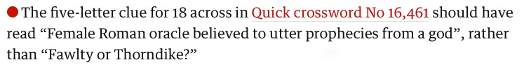
It is also a tense moment if there’s ever a mistake in a crossword clue, and I cringe in sympathy every time one appears in the corrections column. Puzzlers are a vocal and demanding clientele. But when this one appeared last week, I honestly couldn’t work out what was wrong:
Did you get the answer? I did, or I thought I did: the same for both clues. But do you see the reason for the correction? I could only assume it must have been a “tone” thing. Some objection to invoking Mrs Fawlty because of the resonance of Basil’s “yes, dear” disparagements? An unpalatable resonance of 70s sexism as entertainment? But no, it’s more simple and practical than that. It’s because, even though they derive from the same word, Sybil, as in Fawlty or Thorndike, is spelled Sybil, and sibyl, as in female Roman oracle, is spelled sibyl. The problem isn’t political correctness: it’s because spelling 18 across as the name makes it impossible to get 14 down (“Disgusting” (4 letters); answer: “icky”).
Sibyl, then, joins the (I like to think short) list of words I’m not quite sure how to spell. Bill Bryson tells the story that he got his job on the Times subs’ desk in London by correctly betting his interviewer that he was the only one in the building who could confidently spell “Cincinnati”. At one time, I couldn’t spell it either, but I’m there now, after diligent memorisation (one n, two n’s, one t). I can hope to do better in future this time too, if not actually prophesy it.
Also, googling round the subject seems to suggest that puzzle errors are not as rare as one might suppose. In 2006, the high-profile crossword editor of the New York Times, Will Shortz, published a list of all the mistakes that had appeared on his watch to that point (he started in 1993 and is still in the job today). Some of them are simple factual errors, but some of them are just the kind of semi-concealed mistakes that any sub-editor would be proud to spot. These two are my favourites:
Full list here. (I also enjoyed the tubular/cylindrical nit-pick, but that clue about the Uzi would be impossibly vague even if it were correct.)
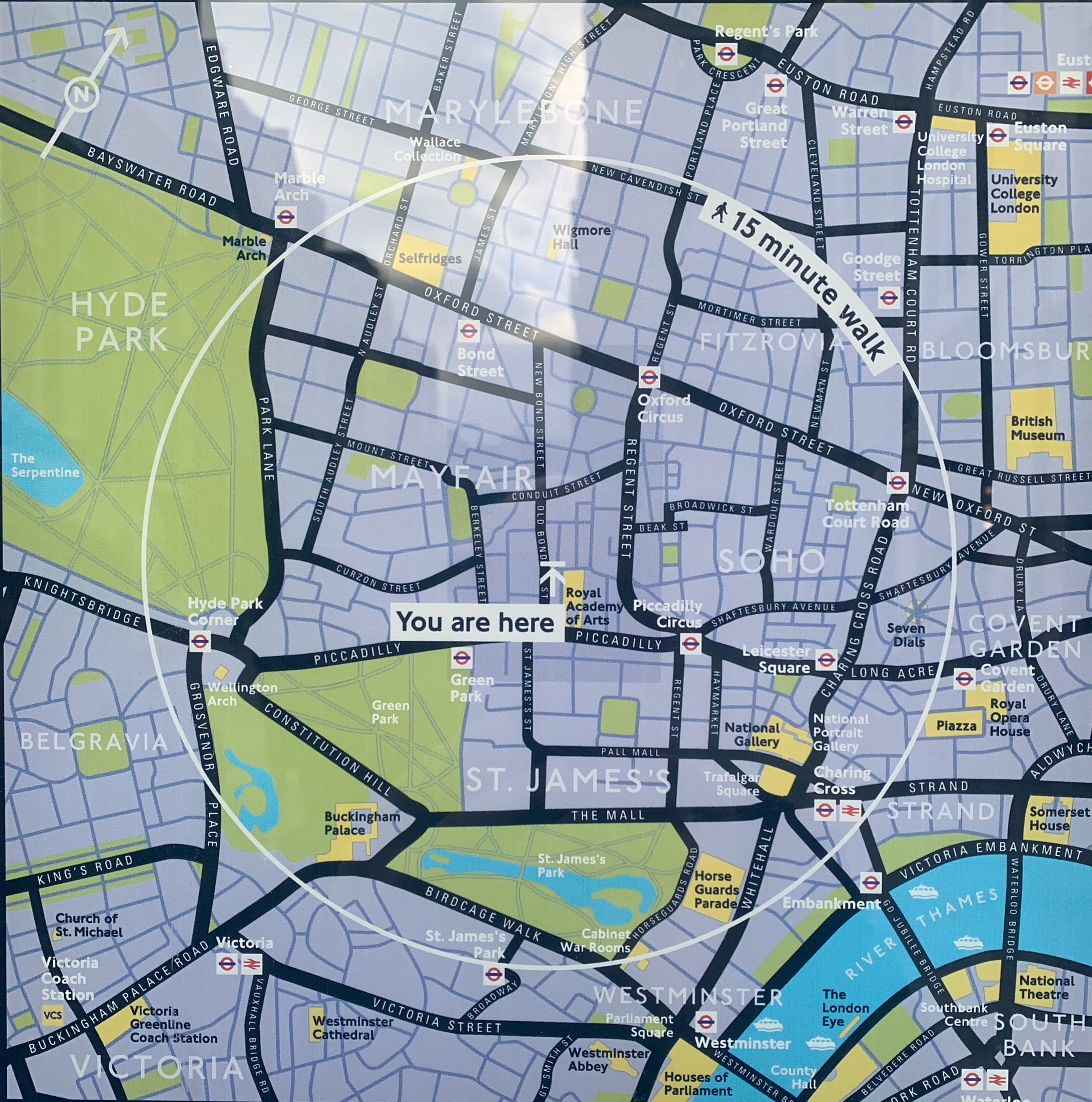
Many years ago, I swear, Private Eye reprinted without comment a map from another publication showing the major cities of Spain in accurate relation to each other – but overlaid on an outline that was clearly the shape of France. The Tribune has had its moments with maps over the years, but I’ve never seen us do anything like that. And I’ve never seen anything quite like this pair either, on a public information point in no less a thoroughfare than Old Bond Street.
I was just passing on a meandering walk around the West End and stopped to look. The first map is a completely normal map of Mayfair for tourists. The second one, which was on the other side of the information point, is … well, I’m not quite sure what it is. I stared for a full minute trying to work out what I was looking at. Buckingham Palace seemed to be further south than Lambeth Palace. The South Bank was on the north bank. I had to walk round the sign and look at the first map again to realise what they had done: they’ve flipped the pictorial part of the map over while keeping the labels the same way up.
Now admittedly there is a discreet symbol on the bottom right showing that “North” is in what one would think of as a south-westerly direction, but is that what you would normally expect from a map like this – that visitors would have to mentally rotate it in the manner of a teenager doing a cognitive aptitude test? Taking it at face value, Hyde Park appears to be east of Mayfair, whereas of course it is west. If you glanced at this and set off using the position of the sun or your phone compass as a guide, you’d never find it. Even if you followed the street layout, you’d still start out the wrong way.
What could Westminster Council be thinking here? It threw me for a loop, and I was born in London and have lived here for the last 25 years. Imagine being a tourist and trying to work it out. I haven’t shown this to the Tribune’s graphics desk – who have been producing daily maps of the shifting tides of war in the Donbas with barely a mistake for 12 months – in case it distresses them. But this seems so finished, so “meant”, that I can’t shake the idea that I’m missing something, and that this is some known and legitimate form of map-making. I might get in touch with the council and see what they say – watch this space.
UPDATE: It has been patiently explained to the blog by its friends that of course the point of these maps is that they are “direction of travel” maps. I should have realised something like that by the fact that they were so different on opposite sides of the same signpost. The “upside down” map is for people walking in a southerly direction down Bond Street – it has been pre-rotated so that when you look at the map and then look up, you can see the street layout in front of you the way it’s drawn on the sign. I get it now! But just to make a few observations:
Apart from the very discreet North orientation arrow on the maps, there is no obvious “you’re facing this way” indicator on the maps, leading to point two.
What are your expectations of such maps? Mine would be that they would be simple north-at-the-top drawings in the context of public information points – the simple standard everyone would understand? But maybe that’s just me.
This would probably have been less confusing (to me, anyway) if Bond Street didn’t run almost north-south. That means the northbound map looks deceptively like a simple north-is-up map (although in fact it isn’t).
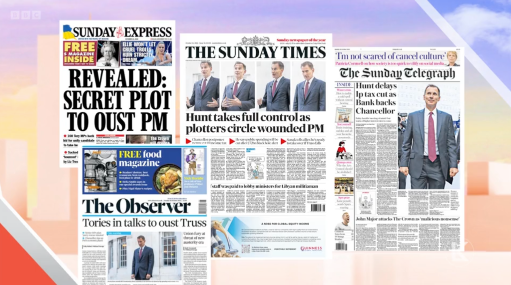
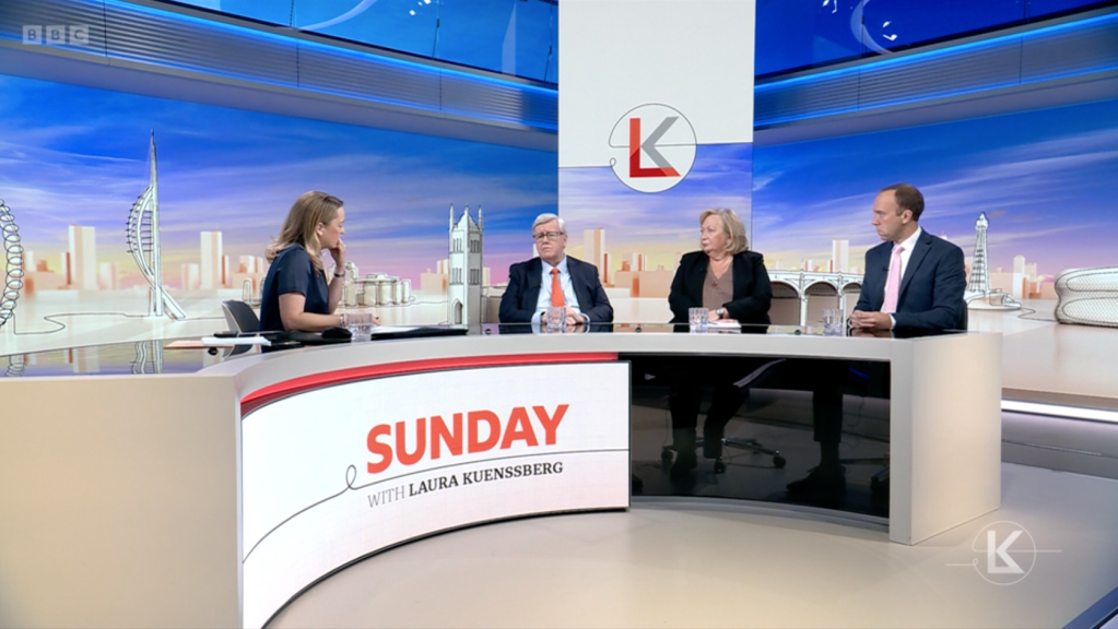
A brief glimpse of the front pages on Laura Kuenssberg on Sunday. Credit: BBC
As this blog is fond of saying, there’s nothing like page one. While breaking news went online a while ago, British newspaper front pages still retain a salience vastly in excess of their dwindling sales: nothing beats them for rhetoric, and nothing in the digital realm has been invented that has their capacity to summarise the events of a calendar day.
Despite app alerts and rolling broadcasts, the 24-hour news cycle still exists, and nothing fits into it quite so well as a daily newspaper. That is one reason why there is still a What The Papers Say-style segment on TV and radio news programmes, morning and evening. Or at least, why there has been until now.
However, the BBC TV’s new flagship politics show, Sunday with Laura Kuenssberg, seems to be breaking with this tradition. Whereas her Sunday-morning predecessor, Andrew Marr, would show every paper in turn, poring over sellotaped double-page spreads and holding articles up to the camera, Kuenssberg throws up a perfunctory montage of some, but not all, of the front pages on a single screen before pulling it down again and turning to her guests. Marr used to have two journalists on the show to talk about the journalism; Kuenssberg seems to operate an anyone-but-hacks approach for her three-person panel, who discuss issues at her prompting with scant reference back to what the papers have actually been saying.
The blog has dreaded this moment: the possible first signs of the waning currency of the front page. I rather thought it would happen as a result of the advance of online news organisations into the discussion (where they are fully entitled to be), rather than simple lack of interest in the Fleet Street agenda. Nonetheless, it’s unsettling.
Does it matter? Of course it does to a middle-aged print hack like me, but more widely? I think so, especially given what has been said about social media recently in the US culture wars.
Over on HeadsUp, there is an excellent post about the fallout from the “Twitter Files” – the leak approved by Twitter’s new owner, Elon Musk, of discussions on censorship and moderation under the site’s previous management. It cites one of the journalists involved in publishing the leak, Matt Taibbi, who writes that he had felt “the version of the world” he had been receiving from Twitter pre-Musk had been “distorted” and “ridiculous”, and that the discovery of the moderation discussions had been a “balm” for him.
“This is the reality they stole from us!” he writes of the censors, making the complaint often heard on the American right that liberal censorship and “cancel culture” has silenced certain voices in certain debates, including ones he wanted to hear on Twitter.
However, as HeadsUp puts it:
What baffles me most about the “Twitter Files” is the quaint belief that someone – generally “our elite overlords” or some variant on that – monkeyed with Twitter and ruined forever the level media playing field on which American politics had played out from the dawn of time through 2019 or so.
To which one could go on and on, but – has AM radio just entirely vanished from public consciousness, or did none of you out there hear Rush Limbaugh’s “Largest Radio Rally in History,” featuring two hours or so worth of Donald Trump… four weeks before the 2020 election?
That last point skewers the weakness in this type of argument perfectly: no media organisation is necessarily obliged to align its values completely with one’s own. Twitter was entitled to be dubious about the bona fides of the Biden laptop story: Fox News is fully entitled to embrace it. Both are private companies with the power to set their own rules, standards and agendas. A disagreement on this issue with one social media network – and one that is far from being the largest in the world – is not evidence of a conspiracy.
In times gone by, there was a tradition of impartiality, or hands-off fair dealing, in mainstream American journalism, where newspapers with geographical monopolies would play it straight down the middle, politically speaking, so as not to alienate half their captive audience. Critics of the US media scene, such as Prof Jay Rosen, have dismissed this approach as “the production of innocence” – an artificial neutrality that can fail its readers when difficult truths need telling. And in any event, as HeadsUp says, the advent of new media in the form of Fox News and shock jocks has shattered the old non-partisan model.
But it’s tempting to wonder if some of that tradition still informs the likes of Musk’s and Taibbi’s expectations: that there should somehow be one “version of the world”, one consensus “reality” that sounds the same from all media outlets. If so, it is an American rather than a wider anglosphere problem, because British audiences – thanks to the partisan excesses of Fleet Street – have never believed that.
Laura Kuenssberg discusses the papers with a non-journalism panel. Credit: BBC
As a whole, the British newspaper industry will never present what Barack Obama calls an “agreed set of facts”, but it does manage to produce a plurality of facts – a sense that, taken in the round, most stories, from most points of view, have a chance of being covered. And it’s long exposure to this – at the newsstands, or in the broadcasters’ press reviews – that I think insulates the British public from the slightly paranoid fear of having “reality stolen” in the way Taibbi describes.
The UK national press has never been trusted for its probity, but it is, grudgingly, trusted for its breadth. It ranges so far to the left and right that most constituencies feel their views and concerns are getting an airing. The messages are not front and centre on every platform, but they will usually be on one or two. This has also led to a sophisticated form of media consumption in Britain in which even hated papers will be given a selective hearing if it appears that they’ve got something big – think of the Guardian on the Windrush scandal, the Daily Mail on “smart” motorways, or the Telegraph on MPs’ expenses. British readers have learned to look past newspapers’ glaring institutional biases if the bona fides of a story are convincing enough.
One of the main reasons this mechanism functions is because of programmes such as What The Papers Say and its successors. Because broadcasters are regulated for impartiality in the way papers are not, they must be even-handed about every front page they show, but are not obliged to identify with any of them. Meanwhile, the parade of different agendas and political positions, one after the other as the front pages flash through, is broadening and chastening for viewers: you see your concerns aired in one headline, but a quite different set of priorities in the next one. Many “realities”, not just one.
However, if you take the Kuenssberg approach of curating the talking points and reducing the warts-and-all selection of front pages, you lose that sense of a world beyond the careful broadcast-news consensus. In effect, you take the responsibility of setting the news agenda, the points for discussion, yourself, rather than letting the papers do it for you – and perhaps eventually exposing yourself to criticism, like Taibbi’s, that you are narrowing the discussion.
Fleet Street is guilty of many sins, but its journalism still plays a vital role in complementing public broadcasters’ – not because it is better, but simply because it is more plural.
We used to be disciplined about this. For headlines, the rule was three and three in mobile view – that is to say, three decks of headline and three decks of standfirst, and no more, when looking at a Tribune article on your phone.
That’s pretty tight, so I used to allow myself to go three and four or four and three (OK, sometimes even four and four).
But now look what’s happened.
The Audience department has started brightly saying things like “it’s sometimes worth going slightly longer on a headline to add a kicker that punches up the drama!”. And with just that brief exposure to SEO radiation, the town’s gone crazy and giant monstrosities have BROKEN LOOSE.
Some of these headlines are literally double the height of what we restricted ourselves to in the old days. The thinking used to be that you would want a reader to see the whole headline and the standfirst, at least, on the same screen, to engage them before their attention wandered. Now you have to scroll just to get to the end of the first element. Long headlines may be able to punch up the drama, but perhaps not if you can’t read to the end of them on anything smaller than an iPad.
And that’s before you even consider the issue of the view in desktop mode. Many fewer people read the site on a computer than on a phone these days, so the rule is “make it look good on mobile”, but the appearance on the big screen still matters. The way the Tribune system is set up, there’s a sweet spot at about the three-and-four length that comes out neatly as two-and-two on desktop. There isn’t a built-in length guide in our software, but after a while you get used to hitting it, and making sacrifices to avoid creating, say, an orphan on a third deck. Now it seems they want us to pack the furniture with all the interest as well as the search terms, and hang the look or the length.
If you have any involvement in online media, you soon learn that search engine optimisation goes in phases. Pure SEO is, when you think about it, an unusual job – in effect, analysing and guessing how a private company’s proprietary algorithm might be working. Being a professional Google-watcher has its tribulations: for example, it used to be thought 15 years ago that repeating search terms in the headline and the standfirst was the key to being seen. Then it was thought that the standfirst might matter less for visibility than the main caption, and so on.
However, as the SEO role has expanded into what is now called “Audience”, it has engaged more widely with social media and news aggregator services, and is becoming – somewhat to sub-editors’ chagrin – a general headline-critiquing service in which social impact and readability are judged alongside search-friendliness. The rules are changing, again, and as one’s age and inflexibility increases, the harder it is to keep up.
On the other hand though, who’s to say they aren’t right about this? Which is the most successful British newspaper website of them all? Mail Online. And how long are Mail Online headlines? Well, er …
Eight decks, with an orphan. In desktop view! As well as a four-deck standfirst. It makes us look like amateurs. It also tramples all over the idea of brevity as a virtue in journalism: but maybe brevity was only a virtue when there was limited space, in the days of print? This is long, rambling and takes a whole breath to read out loud, but it contains every single likely search term relating to the story, and there is no shortage of space on the internet. Maybe length is not the issue at all any more. Maybe online visibility is the only thing that matters?
As the holidays approach, Ten Minutes Past Deadline has thrown some presents in the boot and is joining the queues on the M25 for its short peri-festivus break. Happy Christmas to all, and see you in the new year.
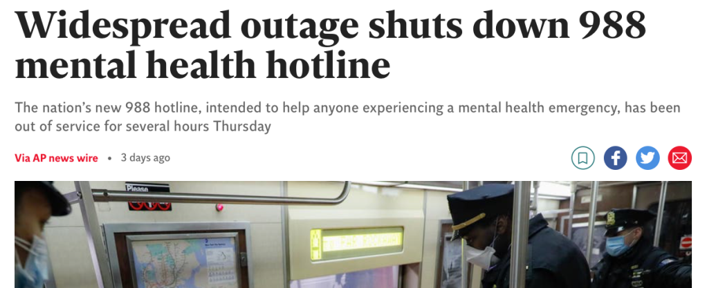
This summer, the US launched a new suicide prevention hotline number, 988. There have recently been technical problems with it that forced it offline for a period. For some reason in the past few days – perhaps as a result of this news – some British Twitter users started copy-pasting and retweeting boilerplate text to raise awareness of the number as if it were a service in the UK, even though, of course, it isn’t, and that number here connects to nothing.
988 is a new phone number that has gone live in the UK to help people in a mental health crisis. The line is dedicated for anyone in need of mental health assistance of any kind please share #MentalHealthMatters#MentalHealthAwareness
The Independent is not one of the British news organisations determined to break into the US market – it’s UK-focused – and yet this story that it published last week seems to be a straight Associated Press wire story for an American audience. The headline, the opening paragraphs and even the photo are identical to the original version on the AP site.
As McNally says in his post, “for obvious reasons, sharing false information about emergency mental health services has enormous potential to cause serious harm”. And he rightly points out that here,
“nobody thought to make it clear at any point in the copy that this is an American story. It mentions a US health agency and a US health official but it’s full of references to ‘national’ services and ‘the nation’ without ever once explicitly stating *what that nation is*”.
He also says that several British people linked to this article to defend the information they had shared, because it’s so ambiguous about location. Arriving at the story almost 48 hours late, and with the rebuttal effort in full swing, I can’t now find any tweets that explicitly do this (although it may have happened on other social media). But even without a social media kerfuffle, the potential for this article to confuse, when presented on a UK site without any context, is clear. (Look at the bald headline in the screenshot above, on a site belonging to a British newspaper with not much of an international profile. Where would you conclude this hotline service might be based?)
As you read it closely, you see clues: 911, which is mentioned as “the emergency line”, is of course not the UK’s emergency line. Britain has no “Department of Health and Human Services”. The number was out of service “for several hours Thursday”, not “several hours on Thursday”. “Counselors” is given with one L, not two. But these are things that an editor would notice, not necessarily a member of the public.
At the Tribune, we have a lookup table for crisis hotline numbers in our three markets – the UK, the US and Australia – and add them as footnotes to relevant stories according to which audience the piece is intended for. In the UK, the number we give is 116 123, for the Samaritans. But as we have discussed many times on the blog, content intended for one market has a way of leaking across the website and being found by readers abroad.
That’s why the Tribune’s audience and SEO team, despite their rapacious appetite for clicks and sensation, still insist on us making clear in every headline or standfirst which country the news we report is taking place in. A footnote at the end is all very well, but the word “American” in the Independent’s standfirst here would have killed off the confusion at source.
Observing from outside, the article gives every impression of having been auto-launched without editorial intervention. However, if you read it word for word against the version on the AP site, there are some differences. This paragraph appears in the AP version but not in the Indy version,
“Veterans who are looking to reach the helpline can call the Veterans Crisis Line directly at 877-267-6030. The outage is also affecting the Substance Abuse and Mental Health Services Administration’s Disaster Distress Helpline.”
and this additional information appears at the end of the agency’s version too:
“In a statement on its website, the company said it is ‘experiencing an incident that is impacting production across numerous systems’ and is ‘working diligently to restore service.’”
It’s not entirely clear why this is so. If these are the interventions of an editor at the Indy, then it’s worrying that they made those emendations but not others that would have clarified the story fully. (Also, why would anyone delete the contractor’s statement at the end?) It is perhaps more likely that these are additions from a later write-through by AP reporters, and that the Indy fetched the story for its site before they were filed; obviously the AP’s own site will always have the fullest, latest version.
If the latter is the case, then the article would indeed seem to have published with minimal human intervention, which calls to mind the complaint voiced for years by the old Testy Copy Editors website: “Hundreds of newspapers run AP completely unedited!” If that was a problem in the old days of American print, then it must be even more so now that hundreds of websites – and not all of them in the US – are running AP unedited too.
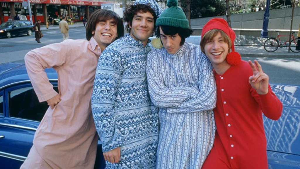
Don’t you think it looks just like them? What, you don’t?
In an embarrassing incident in the Tribune’s news section recently, this picture was sent through by the picture desk to illustrate a story about Monkees memorabilia, went to the sub, who didn’t notice anything wrong, then into revise for me, who didn’t notice anything wrong, then to the production editor and duty editor, who didn’t notice anything wrong, then to the newsstand, whereupon almost everybody immediately pointed out that – yes – those aren’t actually the Monkees.
This always happens on large pictures on page three, doesn’t it? Never to little ones in the Nibs. Anyway, these are the four lead actors in Daydream Believer: The Monkees Story, a now little-seen and modestly rated biopic that came out in 2000.
I can’t even claim to have not looked at the picture. I was totally fooled by Davy Jones (George Stanchev), thought Michael Nesmith (Jeff Geddis)’s body language looked convincing, then stared at LB Fisher on the right of the group and thought “wow, Peter Tork looks young”. Not a trace of doubt in my mind. (In my defence, even Variety, while not very taken with the film, was reportedly impressed with the “close replicas of the original Davy, Mike, Micky and Peter”.)
Admittedly, once the inquest has begun, you immediately notice that Dolenz (Aaron Lohr) is perhaps a little less of a lookalike than the others. Also, there’s a distinctly modern-looking car in the background of the picture. Also, if you’re going to get seriously forensic about it, that shop in the background appears to be a branch of the convenience chain Rabba, which operates almost entirely in Ontario. (Although no reason, I guess, why the “prefab four” – as I discover they were wittily known – shouldn’t have been in Canada in the 1960s).
All sorts of things can go wrong. The agency caption might be ambiguous. The agency caption might be wrong. The agency caption might be right, but nobody has read it closely enough. The revise sub is probably the last person who will read it closely before the readers do. So when you’re revising them, you can’t just be a believer. You’ve got to see their faces.
The Tribune has been running a headline competition in recent months, and with the self-effacing reticence that characterises our profession, I have been showing off shamelessly trying to win it. (Not entirely successfully: because you have to be nominated by your peers to get in, not all one’s efforts bear fruit. On one story about enfant terrible Jake Chapman’s first solo art exhibition without his sibling Dinos, I wrote the kicker “Art brother, where are you?” and sat back in proud expectation, only for it to pass through the revise queue without comment and vanish from sight.)
You would think such competitions would be the pinnacle of a sub-editor’s career – that success would be like winning an intra-office Oscar. But of course they aren’t: copy-editors are not naturally born to triumph. The yardstick that really measures our lives is a much more negative and sobering one: the corrections column.
Perhaps there are some of us who never feel the need to look at them, or read the daily email of shame from the readers’ editor, but on the Tribune’s business desk, the Production Editor and I are riveted to the corrections. They appear on our Visual Planner software on Friday afternoons in the Comment section, at which point work fairly soon stops and we click to view. Even before calling up the preview, you can see on the little page thumbnail how many corrections there are from the size of the box: just a few inches deep, with a reader’s letter underneath? Phew: not too many this week. Filling the whole depth of the column? Uh-oh.
Then we begin reading, nervous of seeing a subject or headline we recognise. “In our recipe for sourdough batons…” Nope. “Mussorgsky did not, as we stated last week…” Nope: Review section. “In our story on British technology startups …” Oh shit. Crushed again by a misconverted currency or even a reporter’s error that we could have discovered with a little more effort, we confess to each other our sins.
My own career low point occurred when an entire corrections columns ended up being filled with errors perpetrated in a piece I had edited. Written by a famously bohemian correspondent in New York about former Vanity Fair editor Tina Brown, it arrived from the desk very late and full of vaguenesses, writerly flourishes and unrebutted hearsay. Foolishly, given the hour, I thought to myself “I can save it!” and tried to fudge or cut as much as possible of the dubious stuff so as not to miss deadline. (MEMO: Never do this. No matter how late it is, if a piece is obviously undercooked and substandard, send it back and have a row with the desk. You can’t “save it”.) Brown rightly complained and it emerged that, in the chaos, I had even contrived to miscalculate her age.
None of our anxiety about corrections is relieved by the emerging phenomenon of what we might call Readers’ Editing as Performance. This blog has fulminated before about corrections columns that have fun picking apart the editorial cartoon or making erudite jokes about the Teenage Mutant Ninja Turtles. It’s all great fun for the people who haven’t made the mistake: and when it isn’t really a mistake at all, even those jokey “corrections” still rankle. That’s why, despite the cock-up being as good as this one – because, you know, the irony – you can’t help feeling a pang for the person who missed it.